| Image |
Comment |
| 07/08/2005 07:22:19 AM |
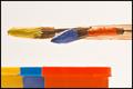
Primary colorsby AranchaComment by Refocused: Nicely arranged. I like the break in continuity exhibited by the bent brush in the middle. It adds interest. Very creative. A little more saturation might make the colors jump out a little more. |
 Photographer found comment helpful. Photographer found comment helpful. |
| 07/06/2005 11:57:25 AM |
Primary colorsby AranchaComment by jemison: the colors on the brushes don't seem to match those on the object, esp the blue and red. good focus and lighting |
| Photographer found comment helpful. |
| 07/06/2005 09:59:37 AM |
Primary colorsby AranchaComment by hyperfocal: Good concept. Nice colors & subject matter. I think the composition would have been more interesting had the brushes were placed in a diagonal. Also the contrast could have been punched up a bit to emphasize the bold colors. Good work. |
| Photographer found comment helpful. |
| 07/06/2005 02:23:19 AM |
Primary colorsby AranchaComment by srdanz: Red looks orange on my screen, and I just checked the monitor before writing this comment. But that's besides the point, as this is not the primary colours challenge. Like the brushes and esp. how the middle one is bent. |
| Photographer found comment helpful. |
| 07/05/2005 03:52:17 PM |
Primary colorsby AranchaComment by srbrubaker: The paint on the brushes is very interesting and attractive. The parallelism of shape between the brushes and bars is interesting. And the lighting is beautiful.
There are a few quibbles one might have. The paint colors do not seem to match tha colors of the bars - for whatever reason. In fact, the bars don't seem to match - there apears to be a slightly greenish azure blue and a less saturated but more primal blue. Somehow, the way the brushes are so tightly aligned seems gratuitously static, especially because the materials in the brushes are the only sources of life in the photo - and the globs of paint obscure them. It is so artistically done that I am sure the photographer has a thousand times or perhaps a million times the training in the graphical arts as the commentator; still I feel strongly about these niggling little details... |
| Photographer found comment helpful. |
| 07/05/2005 02:18:09 PM |
|
| Photographer found comment helpful. |
| 07/05/2005 10:33:39 AM |
Primary colorsby AranchaComment by madison461: Your red looks orange. To be truely primary, it should look red, don't you think? Nice concept and composition. |
| Photographer found comment helpful. |
| 07/05/2005 04:25:20 AM |
|
| Photographer found comment helpful. |
| 07/05/2005 12:19:13 AM |
|
| Photographer found comment helpful. |
| 07/04/2005 09:43:43 PM |
|
| Photographer found comment helpful. |
Home -
Challenges -
Community -
League -
Photos -
Cameras -
Lenses -
Learn -
Help -
Terms of Use -
Privacy -
Top ^
DPChallenge, and website content and design, Copyright © 2001-2026 Challenging Technologies, LLC.
All digital photo copyrights belong to the photographers and may not be used without permission.
Current Server Time: 07/17/2026 11:04:36 AM EDT.