| Image |
Comment |
| 01/18/2005 10:06:31 PM |
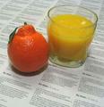
Pulp Fictionby mpalitangComment by Tuckersmom: Something about this has been bothering me and I finally put my finger on it. I don't like the 2 different orange colors. I think one or the other would have been better |
 Photographer found comment helpful. Photographer found comment helpful. |
| 01/18/2005 03:23:00 PM |
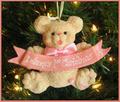
Delaney's First Christmasby mpalitangComment by rmtm333: Cute image and congratulations Delaney. Image is slightly out of focus. Good choice on matching the border to the banner (some others of course will probably not like it). Good Luck. |
| Photographer found comment helpful. |
| 01/18/2005 02:19:08 AM |
Delaney's First Christmasby mpalitangComment by ubique: Look on the bright side ... no-one can say it "doesn't fit the challenge". However, I'm afraid the fact that it no doubt has great meaning for you isn't enough to make it a great photograph. To my eye, it's flat and, alas, not very interesting. I bet it wasn't REALLY your best shot of 2004. In which case it doesn't fit the challenge after all. Best wishes to Delaney for many more. 3. |
| Photographer found comment helpful. |
| 01/17/2005 08:21:35 PM |
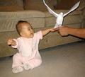
Daddy I want a dove for Christmasby mpalitangComment by just-married: Originally posted by mpalitang:
Originally posted by nshapiro:
Very good action shot and exposure of the bird, but the scene makes it look too much like a snapshot. On a studio like background (and maybe with the babies eyes open) this could have been a winner! |
I agree 100% with all of this! I guess I need to find cheap ways of creating a "studio". |
A fairly inexpensive solution that would have worked in this case is a large piece of fabric draped over the couch and onto the floor. I use black moleskin polyester and it is TERRIFIC for absorbing all of the extra light. After a little bit of burning in PS, you can't see the fabric at all. All of the photos on black in my portfolio are on this fabric. :-) |
| 01/17/2005 07:35:52 PM |
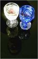
Reflectionby mpalitangComment by mpalitang: Originally posted by glad2badad:
The glass on the left is a bit distracting - seems a bit blown out on the glare/highlights. I'm glad you choose two different colored glasses instead of just one, that was a nice touch. Seeing some spots on the table, are they reflections from the ceiling? |
The spots on the table are scratches on the glass table (it's an OLD table). Since this was a Basic Editing Challenge, I thought it best not to mess with the imperfections and play it safe. |
| 01/17/2005 07:09:44 PM |
|
| Photographer found comment helpful. |
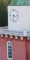
| 01/17/2005 06:00:55 PM |
Clock Towerby mpalitangComment by JoelHSmith: Nice subject. Photo looks a little soft or out of focus. If it was sharper and had more contrast I think you would have a terrific pic. |
| Photographer found comment helpful. |
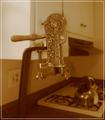
| 01/17/2005 05:58:16 PM |
Estate Wine Openerby mpalitangComment by mpalitang: Originally posted by glad2badad:
Cool wine opener. This shot could have benefited from more of a studio type look instead of the kitchen counter. Kind of a yellowish cast from overhead indoor lights? |
Acutally, there is a window to the left and it was the sunlight coming in. I learned from this shot about the need to white balance. |
| 01/17/2005 04:36:34 PM |
Pulp Fictionby mpalitangComment by gloda: I don't like the composition, it's too static even with the diagonal lines. Also, it doesn't look as if you had put too much effort into this shot. The title fits well, but you had to use the common diactionary method. Also, you've got some bad jpg artifacts in there! 5. |
| Photographer found comment helpful. |
| 01/15/2005 12:51:47 PM |
|
Home -
Challenges -
Community -
League -
Photos -
Cameras -
Lenses -
Learn -
Help -
Terms of Use -
Privacy -
Top ^
DPChallenge, and website content and design, Copyright © 2001-2026 Challenging Technologies, LLC.
All digital photo copyrights belong to the photographers and may not be used without permission.
Current Server Time: 07/16/2026 12:21:41 AM EDT.