| Image |
Comment |
| 08/20/2002 04:58:00 PM |
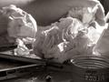
Frustrationby annelizabethComment by daysez: It is realy hard to see the broken pencil even though it is in the forground because of the deep shadows. |
| 08/20/2002 04:42:00 PM |
Frustrationby annelizabethComment by goodtimecharlee: great shot. very nice coloring. would love to know what color you used. i assume this is a duotone. i love the lighting on this. i do have a cropping suggestion. if you would like to hear it let me know. 9. goodtimecharlee |
| 08/20/2002 01:27:00 PM |
Frustrationby annelizabethComment by FranziskaLang: nice concept, b&w works well here. overall, the photo is a little too busy for my liking. the pencil in the foreground is definitely not the first thing i see, and it took me a moment to notice the hand. the bottlecap on the bottom right doesn't really fit in in my opinion. i think if the foreground was a little lighter, more of my focus would be there. -- gr8photos (3) |
| 08/20/2002 10:28:00 AM |
Frustrationby annelizabethComment by Kavey: A little too dark. It could be simpler with just broken pencil and a couple balls of paper, or alternatively I want to see more, what is the tin? What's being written? (Just my opinion) Kavey |
| 08/20/2002 08:57:00 AM |
Frustrationby annelizabethComment by tee tah: I had this VERY same idea... almost exactly! Glad I went with something else, this is kind of depressing. But the photo is good. B&W gives it an even more stark and depressing effect. |
| 08/19/2002 08:18:00 PM |
Frustrationby annelizabethComment by MarkRob: Technically meets the challenge, but I do think this picture has much to do with a pencil. It's more about the crumpled pieces of paper. Interesting study in focus. I like it. |
| 08/19/2002 05:37:00 PM |
|
| 08/19/2002 02:53:00 AM |
|
| 08/19/2002 02:32:00 AM |
|
| 08/19/2002 02:01:00 AM |
Frustrationby annelizabethComment by just-married: I like the composition of the shot a lot. It wants to be one of my favorites of the week, but these's so much light in the center compared with relative darkness now by the pencil. At first I wanted to say boost the contrast, but that would only darken the pencil and lighten the paper. Perhaps shifting the lighting a bit. Still, 8 for now and I'll have to look again during the week. |
Home -
Challenges -
Community -
League -
Photos -
Cameras -
Lenses -
Learn -
Help -
Terms of Use -
Privacy -
Top ^
DPChallenge, and website content and design, Copyright © 2001-2026 Challenging Technologies, LLC.
All digital photo copyrights belong to the photographers and may not be used without permission.
Current Server Time: 07/15/2026 03:06:25 PM EDT.