|
|
|
Showing 241 - 250 of ~444 |
| Image |
Comment |
| 09/26/2005 02:37:15 PM | What's a conspiracy?by okiesisiComment by Artyste: Hello, and greetings from the Critique Club. The critique you are about to recieve is tailored for DPC challenges alone, and is not intended to be seen as an artistic critique per se.
Initial Thoughts
Looks a little fake.. like the whole background was done digitally somehow.
Composition / Content
I'm not sure about the composition. The boy seems just a bit too far towards the side of the photo, making it feel cramped, and giving us far too much space to lose that bomber in. The bomber itself is good, and looks like it belongs in the sky and really does look like it's just flying by.. but the boy looks very.. unreal. As if he was pasted in, or like the background was created behind him. Part of this is the lighting. He's all shaded and shadowed, but the background has harsh daylight lighting. You give the impression that he's just standing outside in the open, but your lighting tells a different story. He might have just been standing in some shade, but I think that's what, for me, makes it look too fake.
Background
It honestly, to me, looks like it was digitally replaced. Had I voted, I probably would have requested a DQ on this for major elements. Now, I don't know if it has been replaced or not.. but that's how it *looks*. Both because of the lighting issues, and the fact that the perspective also seems to be a little off. Also.. what did you tie that stealth toy *to*? I'm just curious about that :) (Actually, now I look at it, were you standing under a tree? that would account for the shade.. and an overhanging limb to support the toy..)
Camera Work / Technical
Besides the lighting that throws me off, there's a distinct lack of focus and sharpness here. The coloring is also just a little flat and dull.
Digital Processing
Your edits seem ok, but are lacking the polish needed to really stand this image out more than it does. Sharpening is one area that could be improved, and a little more color work on the boy's skin tone as well.. it having quite a red cast.
Fits the Challenge
This is an area that is really dependant on the voters' personal preference. I personally don't think it's a very *strong* connection by itself. It seems really static and we're left wondering just what the conspiracy is.. as your title also suggests. I'm sure some people really get it, but others probably didn't at all.
My Opinion of the Photo
Too many elements just turn me off of this photograph as a DPC contender. It looks faked (even if it wasn't), and doesn't have the polish that it might have had. It's a fun photo, but just lacking what it needs to finish strong in a challenge. Good luck in future challenges.
|  Photographer found comment helpful. Photographer found comment helpful. |
| 09/25/2005 03:39:37 PM | What's a conspiracy?by okiesisiComment by okiesisi: DIdn't mean to fool anyone, Quickshutter had the right idea... It was a toy hanging behind my son! Anyway, this one was fun and thanks for all the comments!
~~S |
| 09/24/2005 11:30:30 AM | | | Photographer found comment helpful. |
| 09/23/2005 01:45:42 PM | | | Photographer found comment helpful. |
| 09/22/2005 01:07:46 AM | | | Photographer found comment helpful. |
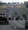
| 09/21/2005 01:10:32 PM | The 5:00pm Driver's Perspectiveby okiesisiComment by KaDi: *Critique Club*
You have chosen an interesting perspective--both the point-of-view of the driver and the scene itself. The lines of the road play to the traditional "art" concept of converging lines of perspective. They show the depth of the scene well. The near symmetry of the roads offers balance to the composition. Much for the eye to travel around and visit.
The story in this photo, as I read it, is of being on the better side of the road at rush hour. I think if the truck on the left were absent the viewer would have a clearer view of the backed-up oncoming traffic...it would also lend more open space to give a stronger feel of the freedom of being on your side of the road. The near vehicle on the right contributes to the sense of being locked in as well.
The light falls on the far point of the hill. I think that helps take the eye into the distance. But once there, the sky is rather disappointing--not a huge detraction, though.
What probably hurt this most in the challenge has already been mentioned by several of your commenters--the image quality is not very strong. Grain (or noise) is fine for some subjects, but it gives this image the feel of something printed in a newspaper. I think the tonal range is also limited--again, not always a bad thing, but could the post processing have made some of those reds in the oncoming trucks "pop"? Are there undiscovered grey-tones whose detail has been lost that could make the photo richer, or more 'real'?
Normally, I'd say, "Go do it again, and try to improve your result based on the comments you find helpful..." However, I think I'd rather say, "Please drive carefully--both hands on the wheel and both eyes on the road." =)
Good luck in future challenges!
--Kadi | | Photographer found comment helpful. |
| 09/21/2005 12:14:35 PM | Day 1 Portraitby okiesisiComment by okiesisi: 
ok, since so many did not like the filter effect, I am posting the original for those who are interested!!
~~SiSi |
| 09/20/2005 07:24:46 PM | New Branches from nothingby okiesisiComment by e301: From the Critique Club
I think you have the beginnings of an idea here - in fact, I spent some part of the very littel time I had around this challenge trying to get something similar, though with branches coming out of walls. So the basis of the shot is, I think, a winner. One could nit-pick about whether or not those shoots constitute a branch, but I think that's best left to the dictionary-obsessives that lurk around the challenge description page.
I can't say you've even begun to suceed with the shot, however. The placing of the shoots in frame is the only point in this shot's favour; at least you've avoided the dead-centre madness. First rreactions are important, not only here where the voting is generally so very fast, and the first impression here is that the shoots are out of foucs. My next thought is - why? And I can't, however I stretch my mind, find a reason for that, artistically. That feeling is only slightly relieved by the follow-up observation that it would be difficult to declare that the ground is focus either.
It's difficult to say much more - it has a quality of anti-photography about it - in that it's actually quite difficult to bring one's attention to the plant, and prevent the eye from drifting through the melancholy of the detritus that surrounds it: one os constantly drawn to the colour, and thrown off by the impossibility of finding a place to fix the eye. In that sense it has a form of message - but the lack of apparent control in the tonality and exposure of the background, and the way the fine detial is absent throughout, makes it hard to believe that's a deliberate choice. | | Photographer found comment helpful. |
| 09/20/2005 07:19:37 PM | Day 1 Portraitby okiesisiComment by LadeeM: **Greetings from the Critique Club!**
Newborn babies are always a hit in my book, and this one is no different. I love his sweet little face in peaceful repose. You have a great subject, and that is a start. Seeing as how it is a "Day 1" portrait, I'm assuming your lighting is harsh hospital flouresent lights. Not the best to work with, I know, but it looks like you made the best of it.
What I would work on: Obviously, as others have mentioned, the filter didn't work for you as far as the challenge went. It adds a texture to the photo that takes away from the softness of the baby.
Overall, I think you have a great photo here, very touching and loving. Keep up the good work!
Tara | | Photographer found comment helpful. |
| 09/20/2005 05:44:46 PM | Day 1 Portraitby okiesisiComment by okiesisi: ok, its not your monitor...I used a filter, first for me, had to try something new. Looks like I can cross that one off my list! hehehe |
|
Showing 241 - 250 of ~444 |
Home -
Challenges -
Community -
League -
Photos -
Cameras -
Lenses -
Learn -
Help -
Terms of Use -
Privacy -
Top ^
DPChallenge, and website content and design, Copyright © 2001-2026 Challenging Technologies, LLC.
All digital photo copyrights belong to the photographers and may not be used without permission.
Current Server Time: 07/16/2026 08:14:33 PM EDT.
|