| Image |
Comment |
| 01/23/2009 03:42:15 AM |
|
 Photographer found comment helpful. Photographer found comment helpful. |
| 01/23/2009 12:16:36 AM |
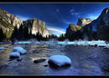
Week-2by DigiFotoBuddyComment by Ken: This is amazing for your first attempt @ HDR; I didn't know it was HDR until I read your comments. |
| Photographer found comment helpful. |
| 01/22/2009 10:59:34 PM |
|
| Photographer found comment helpful. |
| 01/22/2009 10:27:34 PM |
|
| Photographer found comment helpful. |
| 01/22/2009 07:42:59 PM |
|
| Photographer found comment helpful. |
| 01/22/2009 05:00:07 PM |
Week3by DigiFotoBuddyComment by Charlene: Oh my gosh, this is stunning. I love the mix of vibrant colors. I'm just pulled into this. |
| Photographer found comment helpful. |
| 01/22/2009 04:37:36 PM |
Week3by DigiFotoBuddyComment by jrtodd: Very spectacular image, nice job with the HDR. Horizon may be a little to centered for my taste but this is gorgeous. |
| Photographer found comment helpful. |
| 01/22/2009 12:02:58 PM |
Week3by DigiFotoBuddyComment by TrollMan: This is absolutely gorgeous! The vibrant blues mixed with the orange/yellow/read looks very good. There's no doubt this is an HDR but it sure makes great looking images. |
| Photographer found comment helpful. |
| 01/22/2009 08:21:16 AM |
Week3by DigiFotoBuddyComment by nova: Man that is spectacular. I think your sun is round, actually...I came to that conclusion after viewing at 400%. The blown-out sun is round and it is being mirrored in the horizon, giving it that widened appearance. My take, anyway, and I think it looks fine. BTW I also noticed that bit of lens flare just right of center, looks like an easy clone job if you're so inclined. This would make a great postcard or screensaver. Congrats on an excellent photo. |
| Photographer found comment helpful. |
| 01/22/2009 01:25:40 AM |
|
| Photographer found comment helpful. |
Home -
Challenges -
Community -
League -
Photos -
Cameras -
Lenses -
Learn -
Help -
Terms of Use -
Privacy -
Top ^
DPChallenge, and website content and design, Copyright © 2001-2026 Challenging Technologies, LLC.
All digital photo copyrights belong to the photographers and may not be used without permission.
Current Server Time: 07/24/2026 03:39:37 AM EDT.