| Image |
Comment |
| 05/25/2006 10:07:23 PM |
Selfby DigiFotoBuddyComment by timfythetoo: You may not have the most creative shot going but you have a really well done sp here. The red may be a bit much but you did real well. |
 Photographer found comment helpful. Photographer found comment helpful. |
| 05/25/2006 08:59:33 PM |
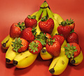
Strawberry Bananaby DigiFotoBuddyComment by Rebecca: This looks like a smoothie waiting to happen... mmmm... This is a nice composition.
Just a little bit of glare on the strawberries, but nothing major. My concern is with the focus. It's sharpest in the center, but my eye is drawn to the ends of the bananas, which are out of focus. |
| Photographer found comment helpful. |
| 05/25/2006 05:21:05 PM |
|
| Photographer found comment helpful. |
| 05/25/2006 05:16:40 PM |
Selfby DigiFotoBuddyComment by Qart: Perfect lighting and a very crisp overall great image... good job! 8 |
| Photographer found comment helpful. |
| 05/25/2006 10:10:35 AM |
Strawberry Bananaby DigiFotoBuddyComment by alexgarcia: Hello from Álex, CTP MkII
First Impression: nice, with a good BG.
Composition: Not sure about it. It's a bit busy for me. I don't know where I'm supposed to look. There isn't a clear focal point for the viewer.
Subject: meets the challenge
Technical: Lighting is good. Colors are very naturals, I like them. The BG is very nice. I'm not sure about the focus.
Improvement: Maybe another configuration of the fruits (you could try with not so many strawberries to be not so busy...). The focus could be shallower (maybe with one strawberry in focus an the rest OOF) or bigger (with everything in focus).
Summary: Nice shot of food.
Álex
|
| Photographer found comment helpful. |
| 05/24/2006 04:15:48 AM |
Strawberry Bananaby DigiFotoBuddyComment by yanko: Greetings from CTP2
Technicals:
Overall, I like the lighting especially the specular highlights on the strawberries. That makes the strawberries look so yummy. I'm not so keen on the shadows the bananas create but really that's not too distracting. The color is also good.
Subject/composition:
Good choice in subject. It meets the challenge. However, something feels awkward about the arrangment. It just looks unnaturally balanced to me.
Suggestions for Improvement:
To make the arrangement more natural looking I suggest having at least one of the strawberries on the ground. Also, I'm not sure about the DOF you used here. At least I'd like to have seen the first row of strawberries as sharp as the top row. That's about it. Good luck on your next challenge and congrats on that top placing in the photographer improvements stat! |
| Photographer found comment helpful. |
| 05/23/2006 01:46:29 PM |
|
| Photographer found comment helpful. |
| 05/23/2006 10:23:06 AM |
|
| Photographer found comment helpful. |
| 05/23/2006 06:32:26 AM |
|
| Photographer found comment helpful. |
| 05/23/2006 02:12:06 AM |
|
| Photographer found comment helpful. |
Home -
Challenges -
Community -
League -
Photos -
Cameras -
Lenses -
Learn -
Help -
Terms of Use -
Privacy -
Top ^
DPChallenge, and website content and design, Copyright © 2001-2026 Challenging Technologies, LLC.
All digital photo copyrights belong to the photographers and may not be used without permission.
Current Server Time: 07/18/2026 02:04:59 PM EDT.