| Image |
Comment |
| 07/07/2006 02:45:54 AM |
|
 Photographer found comment helpful. Photographer found comment helpful. |
| 07/06/2006 11:42:52 PM |
|
| Photographer found comment helpful. |
| 07/06/2006 04:57:37 PM |
|
| Photographer found comment helpful. |
| 07/06/2006 03:12:45 PM |
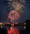
July 4, 2006by DigiFotoBuddyComment by Balko: 0-2 Meets Challenge: 2
0-3 Technical Merit: 3
0-3 Creativity: 3
0-2 Biased Wow Factor: 2
Total = 10
Just wonderful! Placing the bridge there (with the reflection) makes this shot! |
| Photographer found comment helpful. |
| 07/06/2006 01:46:51 PM |
July 4, 2006by DigiFotoBuddyComment by A Weaver: Nice reflections in the water! Would have liked to see the full explosion of the firework that got cut off at the top, but nice picture. |
| Photographer found comment helpful. |
| 07/06/2006 01:08:39 PM |
|
| Photographer found comment helpful. |
| 07/06/2006 09:57:32 AM |
|
| Photographer found comment helpful. |
| 07/06/2006 01:33:42 AM |
|
| Photographer found comment helpful. |
| 07/06/2006 12:56:46 AM |
|
| Photographer found comment helpful. |
| 07/06/2006 12:46:13 AM |
|
| Photographer found comment helpful. |
Home -
Challenges -
Community -
League -
Photos -
Cameras -
Lenses -
Learn -
Help -
Terms of Use -
Privacy -
Top ^
DPChallenge, and website content and design, Copyright © 2001-2026 Challenging Technologies, LLC.
All digital photo copyrights belong to the photographers and may not be used without permission.
Current Server Time: 07/21/2026 04:16:17 PM EDT.