| Image |
Comment |
| 07/31/2006 06:09:07 AM |
|
 Photographer found comment helpful. Photographer found comment helpful. |
| 07/30/2006 07:23:24 PM |
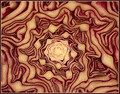
Brassica oleraceaby DigiFotoBuddyComment by Neuferland: Greetings from the Critique Club!
OH NO! :) Just kidding!
I found this after the challenge was over and I really liked the idea. And I think I understand where you were going with the post processing, if I'm wrong, shot me ;)
First of all it does feel abstract to me which means a lot because I don't normally understand or get abstract pictures but this feels like it has a pattern yet you have to really study it to find it. And I personally like the muted colors, gives more the feel of some of the great abstract artists and pictures I've seen (don't ask me to name names, I was told there were abstract) and makes it feel and look a bit older than it really is.
But as you well know the DPC Voter doesn't always understand art or what we are trying to convey with our picture and you paid for that with this shot. If you and brightened the colored just a touch, brought up the contrast and sharpened it just a bit more this probably would have easily been over a 6.
I hope my comments help and Good Luck in future Challenges!
Deannda |
| Photographer found comment helpful. |
| 07/30/2006 06:22:48 PM |
|
| Photographer found comment helpful. |
| 07/30/2006 12:23:50 AM |
|
| Photographer found comment helpful. |
| 07/29/2006 11:43:36 PM |
|
| Photographer found comment helpful. |
| 07/29/2006 11:39:42 PM |
|
| Photographer found comment helpful. |
| 07/29/2006 11:05:54 AM |
|
| Photographer found comment helpful. |
| 07/28/2006 08:16:49 PM |
|
| Photographer found comment helpful. |
| 07/28/2006 04:54:34 PM |
|
| Photographer found comment helpful. |
| 07/28/2006 10:11:54 AM |
|
| Photographer found comment helpful. |
Home -
Challenges -
Community -
League -
Photos -
Cameras -
Lenses -
Learn -
Help -
Terms of Use -
Privacy -
Top ^
DPChallenge, and website content and design, Copyright © 2001-2026 Challenging Technologies, LLC.
All digital photo copyrights belong to the photographers and may not be used without permission.
Current Server Time: 07/22/2026 06:20:11 AM EDT.