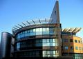
A building of two halvesby
tazzaComment by Mary Ann Melton: I really like the architecture of this building - has such a great use of line, shape, and texture. I like the mix of blues and browns, and the texture provided by the items on top of both sides of the building.
As far as composition - none of your "vertical lines" are truly vertical. You have a perspective issue that complicates the situation -common in architectural photography. If this were my shot, I would do one of two things.
Suggestion 1: Choose an area of the photo roughly in the middle, in this case where the shadow line makes such a big difference in lighting slightly to the left of center. I would rotate the image such that the vertical line here is truly vertical in the frame and the horizontal area there should be level with the bottom of the frame. At this point you could leave it as it is.
or
Suggestion 2: Do step one and then do a perspective correction in photoshop by "selecting all" and then pulling the upper corners out just enough to make the outside walls vertical. Then do a final crop.
I also think you were fighting lighting here . . part of the building is in the sun, part partially shaded, and the far left much deeper shade impacts the quality of the photo. Perhaps a curves adjustment in photoshop could lighten that darkest area.