| Image |
Comment |
| 02/16/2003 10:27:58 AM |
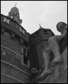
Shipmates of Bontekoeby AzrifelComment by lisae: Very interesting architecture, but the tones in the photo are a bit grey and dismal. It doesn't highlight the textures or the details in the image. |
 Photographer found comment helpful. Photographer found comment helpful. |
| 02/14/2003 02:44:39 AM |
Shipmates of Bontekoeby AzrifelComment by Konador: I like the perspective here but I really think it needs some contrast added in your editing program to really bring out the shadows nicely. 8. |
| Photographer found comment helpful. |
| 02/13/2003 07:56:25 PM |
Shipmates of Bontekoeby AzrifelComment by Swashbuckler: Very clear shot, but a little dark. Challenge - I'll buy it. Interest level - moderate. My eyes keep being drawn to the light at the top of the wall (Not certain if this is a good thing or not, but I don't think so.....On the other hand, it is kinda out of your control...got a sling shot? 7 Swash |
| Photographer found comment helpful. |
| 02/13/2003 10:28:54 AM |
Shipmates of Bontekoeby AzrifelComment by teachme53: Great perspective and composition, lighting is dark and the light at the top of the building is distracting. Another time of day would have allowed for better lighting or some creative shadows. |
| Photographer found comment helpful. |
| 02/11/2003 11:38:56 PM |
Shipmates of Bontekoeby AzrifelComment by kandyj: Very nice use of the challenge. There are a couple hot spots on the foot and the window and at the top. Really like the composition. |
| Photographer found comment helpful. |
| 02/11/2003 08:39:47 PM |
|
| Photographer found comment helpful. |
| 02/10/2003 11:52:34 PM |
Before and After I put on my Glasses by AzrifelComment by indigo997: Wow! Now that's what I call a photographer's comment. I don't vote in the member's challenges so I didn't see this until it popped up on the front page of all places! Congrats.
It's such a simple shot, but very effective. I do really like that font by the way. It fits the challenge so we'll move on to technical aspects. I really like the blur vs. non blur, but it bothers me that the frames are so out of focus. I guess it's impossible to have the part inside the frames in focus and have the frames in focus, not to mention that it wouldn't make much sense since you wouldn't wear glasses that make things blurry... but it just takes a little more thought to actually figure out that what you are seeing is a pair of glasses. I really like the composition. The wide horizontal works very well. The fact that you only show part of the lens doesn't help me figure out what it is I'm seeing, but I wouldn't change that. Good even lighting, but the white does seem a little too grey. I don't know if it's the actual print on the paper or the photo, but the letters in focus have diagonal jaggies on my screen. I like the simple black frame as well. A good example of a frame that works. It is a good shot that was obviously well received. That's a great score. Good idea and good execution so I don't think there's much more I can say. |
| Photographer found comment helpful. |
| 02/10/2003 08:03:58 PM |
Shipmates of Bontekoeby AzrifelComment by jab119: i like the shot and the angle, but it appears to be a bit too dark (for me anyway), the statue in the lower center is a bit hard to make out. |
| Photographer found comment helpful. |
| 02/10/2003 06:49:47 PM |
|
| Photographer found comment helpful. |
| 02/10/2003 04:48:59 PM |
|
| Photographer found comment helpful. |
Home -
Challenges -
Community -
League -
Photos -
Cameras -
Lenses -
Learn -
Help -
Terms of Use -
Privacy -
Top ^
DPChallenge, and website content and design, Copyright © 2001-2026 Challenging Technologies, LLC.
All digital photo copyrights belong to the photographers and may not be used without permission.
Current Server Time: 06/11/2026 10:25:02 PM EDT.