DPChallenge: A Digital Photography Contest You are not logged in. (log in or register
 
Browse Settings
Currently viewing:
MemberAzrifel

Show comments:

Per page:

Order:

Comments:


Comments Received by Azrifel
Pages:   ... [156] [157] [158] [159] [160] [161] [162] ... [225]
Showing 1581 - 1590 of ~2246
Image Comment
Yellow and Blue
12/08/2004 01:01:06 AM
Yellow and Blue
by Azrifel

Comment by whagerbaumer:
Lovely colors, great llighting. The Pot does not seem to go with the color scheme. The fence and trash cans do, as does the pavement. A 7.
Photographer found comment helpful.
The Old Lighthouse
12/07/2004 01:33:45 PM
The Old Lighthouse
by Azrifel

Comment by nordicgirl:
I like lights and toning of your picture... place is interesting too but i feel compozition bit strange. I would leaved ships out for sure... they distract from lighthouse and doesnt add much to picture.
Photographer found comment helpful.
The Old Lighthouse
12/06/2004 08:15:48 PM
The Old Lighthouse
by Azrifel

Comment by dartompkins:
I like this shot, but the crop bothers me a bit. I would have liked to see both sides of the street if possible. My eye seems to drift out of the frame on the right. Still very nice. The building looks very interesting. I would love to see a closer view of it. 8.
Photographer found comment helpful.
The Old Lighthouse
12/06/2004 05:43:33 PM
The Old Lighthouse
by Azrifel

Comment by Discraft:
The sales of the boats are very distracting imo i think you should have gotten closer to the lighthouse. i like the converstion to black and white.
Photographer found comment helpful.
The Old Lighthouse
12/06/2004 12:30:37 PM
The Old Lighthouse
by Azrifel

Comment by Damian:
Nice b&w, looks like the left side of this things is a little busy. And maybe have the bottom of the photo show, the road coming to the camera might look interesting.
Photographer found comment helpful.
The Old Lighthouse
12/06/2004 12:49:08 AM
The Old Lighthouse
by Azrifel

Comment by glass_slippers:
good composition..but very greyish..not enough contrast between lights and darks. The horizon line looks a little tilted to.
Photographer found comment helpful.
Spring Tulips
11/28/2004 02:40:55 AM
Spring Tulips
by Azrifel

Comment by brianlh:
great colors, and especially the perspective. might be some slight noise (on the red flower?), but hardly noticeable and doesn't detract. good shot.
Photographer found comment helpful.
Marken
11/25/2004 12:07:40 AM
Marken
by Azrifel

Comment by sher:
this is just beautiful, Sander! congratulations on your Top 10 finish! (big hugs)
Photographer found comment helpful.
Marken
11/24/2004 01:50:46 PM
Marken
by Azrifel

Comment by Azrifel:
Thanks for all the comments, favorites and even print wish list additions (I'll see what I can do). Here are some answers and info additions:

Moose101 wrote: This must be Italy from the name given?

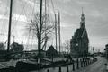
Nope. "Marken" is about 10 to 15km North of Amsterdam on semi-island in the IJsselmeer. It is a very popular tourist location. Mostly the busses go to Marken in the morning, visit a cheesefarm an hour later, next stop Volendam and them off to Alkmaar (near the North Sea) and its cheese market.
I ride (some would call it 'race') a lot on my motorcyle in this area. Especially sunday morning when it is quiet and not many people around. A lot of twisty roads with camber, highspeed and lowspeed corners.
There are also some little old quiet towns nearby (Durgerdam for example), harbours, campings and nature.

Gatorguy wrote: did you smooth it with Neat image?

No, I don't like the Neat Image smoothness. Like I said in the pg note; there was some edge noise reduction (pattern noise) and chroma noise reduction (moiré / color noise), but not much. I was also a bit conservative with the sharpening.

speedylix wrote: Is there a person fishing beneath this small house or I'm hallucinating

You are not hallucinating, but it is not a person. It is a statue of a fishing kid. :)

Shadowrain wrote: I think it would have been improved with a person somewhere

I agree. One reason is because I believe that most scenes do better with people in it. They make a scene come alive, give scale etc. Another reason is the traditional costume of Marken. Because it was shot on a Sunday (religion) there was nobody around. :(
The traditional costume is the most colorful of the whole region (Voldendam, Edam, Monnickedam, Wieringen). Especially the women look great.
I'll remember the places you adviced me to go to next time I visit the US. :)

connie wrote: IR?

Nope, I just played with the channel mixer (see note). I remembered reading somewhere that using negative values in your channel mix to monochrome can create Ansel Adams or IR like effects.

just-married wrote: Once I notice the leaning tower, it's really hard to pull my eye away from it. Is this lens distortion?

Yup, I believe it is.

Marken
11/24/2004 10:05:57 AM
Marken
by Azrifel

Comment by Brenb:
Congratulations on your 8th place. Beautiful shot!
Photographer found comment helpful.
Pages:   ... [156] [157] [158] [159] [160] [161] [162] ... [225]
Showing 1581 - 1590 of ~2246


Home - Challenges - Community - League - Photos - Cameras - Lenses - Learn - Help - Terms of Use - Privacy - Top ^
DPChallenge, and website content and design, Copyright © 2001-2025 Challenging Technologies, LLC.
All digital photo copyrights belong to the photographers and may not be used without permission.
Current Server Time: 09/11/2025 04:45:31 PM EDT.