Silby
messerschmittComment by fotomann_forever: ::: Greetings from Critique Club :::
Hi, as requested, here is an indepth critique of your submission.
First Impression - the most important one:
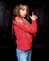
Nice "in-your-face" portrait of a cute young lady. The first thing that catches my eye are her blue eyes and the big square catch lights.
Composition:
I like the "in-your-face" feel of this image, but the crop is making me feel just a bit closterphobic. Back off just a hair in the crop and I feel your comp would be a little stronger.
Subject:
Sharp, in focus and stands out well from the background. Also, while it's not a classical portrait point of view, you have added interest to the subject by getting closer than usual.
Technical (Color, focus, and light):
Color: Good, I don't see much room for improvement here.
Focus: Sharp as a tack.
Light: Looking at the catch lights I see you have most likely used window light. It worked well for you. No unflattering shadows, yet the lighting doesn't come out too flat either.
To grow its vote?:
While I find the shot interesting and fresh, you possibly got some DNMC votes because of the background. It just doesn't look "studio" enough.
Summary:
What can I say, I think it's well done with "limited" resources. Keep up the good work.
Hope to see more from you soon,
Leroy