| Image |
Comment |
| 02/10/2003 05:35:42 PM |
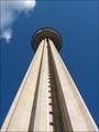
Looking up to the skiesby xertionComment by Jacko: O Canada, my home and native land. Very, very nice shot of the CN Tower. The composition is just right. The only thing I'd like to see changed is to remove the cloud on the upper left side; a bit distracting (take it out with Photoshop and make a copy to hang on your wall). I can easily imagine the shot without the cloud, so I'll give you a 10. Good luck. Jacko. 10 |
 Photographer found comment helpful. Photographer found comment helpful. |
| 02/10/2003 12:12:05 AM |
|
| Photographer found comment helpful. |
| 02/07/2003 08:46:58 AM |
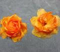
The old "flower cliché"by xertionComment by PTLParsons: Love the constrast between the two flowers. Wish the one on the left had the bad petals pulled off and leave the one on the right as is. Nice background for this shot. Add to the shot well. Too tightly cropped on the sides. Like the cropping on the top and bottom. Of course you know all of our comments are really just our personal opinions, more than photographic techology. You can't help but have your personal likes and dislikes from entering in. From a technical standpoint, I think you did very well. Technical and personal added together gives this a 6. |
| Photographer found comment helpful. |
| 02/05/2003 06:47:33 PM |
|
| Photographer found comment helpful. |
| 02/04/2003 07:27:10 PM |
|
| 02/03/2003 08:18:22 PM |
The old "flower cliché"by xertionComment by Lustre: I like the way the flowers appear to be floating over the background. I don't think there is enough contrast between the petals and the background though, also the flowers look a little weathered. |
| Photographer found comment helpful. |
| 02/03/2003 08:02:03 PM |
|
| 02/03/2003 04:21:27 PM |
|
| Photographer found comment helpful. |
| 02/03/2003 03:03:25 PM |
The old "flower cliché"by xertionComment by blick: these seem to be floating no where. perhaps if they were grounded more they would create more interest. nice detail in the flower pedals! |
| Photographer found comment helpful. |
| 01/29/2003 08:58:53 PM |
Slight Turn Aheadby xertionComment by kandyj: Critique Club:
As noted below, the main flaw in this picture is composition. The centrally located sign seems to lead to nothing interesting. The road being included, or the sign against the sky pointing to the ridge would have added to the quality of the photo.
Technical quality: Good clear capture, clear bright colors, beautiful shot of the sky. I personally don't mind the dings in the sign, makes it very realistic. no post-processing problems noted.
Meeting the challenge: Well done, the sign is the focal point.
Creativity: Well, this is not one of the most creative shots I have seen. I cannot really see any meaning of the sign in relation to the background although maybe the curve goes around that ridge and that is something we need to imagine when viewing the photo. Not really any kind of impact statement made with the shot that I like to see in a photo.
HOpe this helps.
|
| Photographer found comment helpful. |
Home -
Challenges -
Community -
League -
Photos -
Cameras -
Lenses -
Learn -
Help -
Terms of Use -
Privacy -
Top ^
DPChallenge, and website content and design, Copyright © 2001-2026 Challenging Technologies, LLC.
All digital photo copyrights belong to the photographers and may not be used without permission.
Current Server Time: 07/16/2026 11:56:20 AM EDT.