| Image |
Comment |
| 05/01/2005 10:10:22 PM |
St Louis Arch - Gateway to the Westby Juniper366Comment by nico_blue: my first impression of the photo is that it really has a collage like quality to it... not sure whether i like this quality or not but it seems like things are just pasted one on top of the other on the page. |
 Photographer found comment helpful. Photographer found comment helpful. |
| 05/01/2005 10:07:45 PM |
St Louis Arch - Gateway to the Westby Juniper366Comment by Travis99: In my opinion I'm not sure what to focus on the statue the arch or the building. By this I mean the subjects in your photo are competing for attention with out a clear winner. I think photos do better when their is a main dominating subject, a clear object that pops out and says, HEY LOOK AT ME!!! If you have any other questions feel free to ask me.
Travis |
| Photographer found comment helpful. |
| 05/01/2005 04:19:26 PM |
round house for DP.jpgby Juniper366Comment by Beetle: The magic of photoshop - wow, what a difference!
It looks really good now, but straightening it (see Jinjit's comment) would make it even better.
Well spotted for the mirror opportunity. |
| 04/26/2005 08:43:45 PM |
round house for DP.jpgby Juniper366Comment by Jinjit: Yes! this is definately better then your original entry!
Just one more thing that I think you can fix: a very tiny tilting to the left. I think it is a rotation of somewhere around 1.00 degree cw or even a little bit less.
Maybe i'm just being too petty here, but with the more contrast came a certain instability feel due to the tilting, IMO.
|
| 04/26/2005 08:10:54 PM |
|
| 04/25/2005 01:54:56 PM |
|
| Photographer found comment helpful. |
| 04/24/2005 03:15:52 PM |
|
| Photographer found comment helpful. |
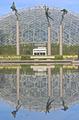
| 04/24/2005 12:10:37 PM |
The Other Halfby Juniper366Comment by fstopopen: good pic. I think that the line where the reflection meets the real thing (horizon line) should be either higher or lower to follow the rule of thirds. my vote is higher. |
| Photographer found comment helpful. |
| 04/24/2005 10:31:05 AM |
|
| Photographer found comment helpful. |
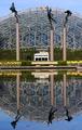
| 04/24/2005 10:13:54 AM |
The Other Halfby Juniper366Comment by e301: You could darken this enormously, i think: in the sense that there are no blown-out highlights it isn't over-exposed of course; but in the sense that all the colours lack vibrancy, and a sense of contrast throughout the image, then it is over-exposed. Cameras meter in an odd way, and it's almost always worth shooting with the exposure compensation set down a stop or two: darker images can always be brought up in processing.
I think this scene is a bit complex to work well as a reflection: certainly at the submission size here. The figures, the dome, the flowers, the house, the greenery ... and the over-lapping of many of those leaves you with an image where there is too much stuff going on for the reflection to stand out. |
| Photographer found comment helpful. |
Home -
Challenges -
Community -
League -
Photos -
Cameras -
Lenses -
Learn -
Help -
Terms of Use -
Privacy -
Top ^
DPChallenge, and website content and design, Copyright © 2001-2026 Challenging Technologies, LLC.
All digital photo copyrights belong to the photographers and may not be used without permission.
Current Server Time: 07/15/2026 02:12:50 PM EDT.