| Image |
Comment |
| 11/18/2005 07:43:46 AM |
Contemplationby alfrescoComment by dahkota: Another excellent image. A story - your job is to figure out which one. I like the clouds at the top - adds to the story. Looks a hair oversharpened but could be due to the size of the image not playing well with my monitor. |
 Photographer found comment helpful. Photographer found comment helpful. |
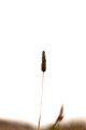
| 11/18/2005 07:40:56 AM |
Perseveranceby alfrescoComment by dahkota: I like this the way it is. Simple. I think centered works very well. The stuff at the bottom, blurred as it is, gives the image movement. The "blown out" part of the stem actually enhances the balancing act going on here - the head is so large, the stem so small, the perception of the wind blowing but not bending the stem - all pull together to mean something. What? for me the first thing that came to mind was perseverence. The stem doesn't break even with the load and the wind. It may not be a 'pretty' picture, but for me at least, it has a story. |
| Photographer found comment helpful. |
| 11/14/2005 01:53:02 AM |
|
| Photographer found comment helpful. |
| 11/13/2005 10:49:27 PM |
|
| Photographer found comment helpful. |
| 11/13/2005 09:27:14 PM |
Parisby alfrescoComment by Jutilda: WOW - that's a blue sky! I think I like it better than the night shot for some reason. The silver and blue make such a "cool" picture. Awesome focus on this and the perspective gives the Eiffel Tower a looming sense. |
| Photographer found comment helpful. |
| 11/13/2005 08:39:14 PM |
|
| Photographer found comment helpful. |
| 11/13/2005 05:27:31 PM |
|
| Photographer found comment helpful. |
| 11/05/2005 11:11:31 AM |
|
| Photographer found comment helpful. |
| 11/05/2005 12:39:09 AM |
Perseveranceby alfrescoComment by samnotis: I don't think the rule of thirds always applies; sometimes dead center is just fine, as I think it is here. I wish it were just the lone stalk, though: I can't make out what the elements at the bottom are, and, to me, they only take away from an otherwise very clean, very pure composition. |
| Photographer found comment helpful. |
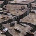
| 11/04/2005 11:29:34 PM |
47 Steps - 1by alfrescoComment by UNTITLED: I agree with the other comments pretty much. The photo's got texture and the subject is good. Maybe so stronger contrast to people to stop and look closer. Contrast emphasizes texture, I think. This on would be fun to experiment with high contrast. |
| Photographer found comment helpful. |
Home -
Challenges -
Community -
League -
Photos -
Cameras -
Lenses -
Learn -
Help -
Terms of Use -
Privacy -
Top ^
DPChallenge, and website content and design, Copyright © 2001-2026 Challenging Technologies, LLC.
All digital photo copyrights belong to the photographers and may not be used without permission.
Current Server Time: 07/16/2026 10:43:22 AM EDT.