| Image |
Comment |
| 06/29/2006 04:01:56 PM |
|
| 06/28/2006 03:03:38 AM |
Glass Plus Sun=Energyby eaglebeckComment by _Io_: This is cropped too tightly - the magnifying glass should have some room on the right. Some of the edges look slightly blurred also. You could add more interest with a little smoke. |
| 06/12/2006 05:15:09 PM |
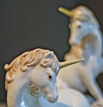
Unicornsby eaglebeckComment by Aghris: This is a weird shot. First, there's too much noise in the foreground. This could be done with some NeatImage. Then, the black glow around the figures look very unnatural, almost as if they are added to the background later. Lastly, the background itself is noisy and uninteresting. |
| 06/12/2006 02:45:02 PM |
Unicornsby eaglebeckComment by Neuferland: I have no reference to the original on this one so I can't look it up. If you would like to send me the link so I can see the difference I would be happy to rethink my score. As is, very noisy, focus is lacking and it looks to be a some camera shake involved. As is a 4 |
| 06/11/2006 11:13:12 PM |
|
| 06/11/2006 03:29:35 PM |
Unicornsby eaglebeckComment by yanko: Much better than the original. The dark halo and grain I assume are things you want in the photograph. Both look more pleasing than in the original especially the dark halo which has a smoother transition into the background vs the original.
As far as the technicals are concern (lighting/composition, etc) there is some improvement here as well although I'm thinking you aren't using enough light and you are brightening it in post processing. However, the unicorns look whiter and the shadows are more subtle this time around and the reflections are less distracting so good job there.
The composition while pretty true to the original looks better in the retake. The background unicorn taking up less space really helped.
Overall, good improvement however I feel the image is still a bit on the soft side. The grain is definitely a love it or hate it thing so some people are still not going to like that you kept it. A good compromise if you wanted to appeal to more people would be to keep the background noisy but reduce the noise on the subjects themselves. Those figurines are pretty smooth in reality so removing the noise there would have really enhanced that aspect. |
| 06/11/2006 08:42:59 AM |
Unicornsby eaglebeckComment by Jamester: Sorry, but this will not do very well I don't think. Out of focus, very noisy and of an ornament looks like a lack of any real effort. Perhaps you did not have enough light which makes autofocus fail and increases the noise? |
| 06/10/2006 07:56:55 PM |
Unicornsby eaglebeckComment by Judi: Nice detailing. I am not sure about the grainwork...if it was intentional or not...but I feel it is not necessary with these beautiful subjects. |
| 06/09/2006 08:10:14 AM |
Unicornsby eaglebeckComment by JunieMoon: I did not like the grain on this one. It took away from the smoothness of the unicorn statue. It appears you did try to reduce the noise on the foreground unicorn, but it is really out of focus. Compositionally, the placement of the statues is very good. |
| 06/08/2006 04:36:55 PM |
|
Home -
Challenges -
Community -
League -
Photos -
Cameras -
Lenses -
Learn -
Help -
Terms of Use -
Privacy -
Top ^
DPChallenge, and website content and design, Copyright © 2001-2026 Challenging Technologies, LLC.
All digital photo copyrights belong to the photographers and may not be used without permission.
Current Server Time: 07/18/2026 09:24:07 PM EDT.