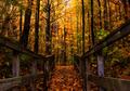
Forgotten Pathby
hi131Comment by digitalknight: more contrast please, and if I may...
what was it that drew you to this photo? to me it's the bridge - but the visual noise from the leaves in front of it - coupled with the fact that the leaves are lighter than the bridge or it's background draws my eye to the leaves.
I would recommend cropping the leaves right out of there. I think of it as "visually simplifying" my photos - making it easy for my audience to see the main subject of what I was seeing, the cool part of what I thought was cool.
So that log in the stream would be the bottom of my photo if this were mine - not that I"m right, but that's what I prefer.
Once I had it cropped, I would add some more contrast, and dodge those midtones on the bridge to lighten them, drawing the eye of my viewer to what I thought was cool.
Now, if you have time, rummage around my portfolio and see if I've lived to my own standard - feel free to let me know where I could do better - or if you think I'm full of brown substance. I'm trying to be helpful, please take it in that spirit. :-)
I would love to walk into your photo BTW. 4