Performance Enhancementby
srdanzComment by Rikki: Hello Srdan. I'll be honest about my comments on this entry (similar to how I leave comments via the Critique Club). these are my opinions so take it with a grain of salt.
Composition:
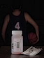
While the subject of your entry is the performance enhancing drugs, the location of the "bottle" (for the lack of a better word) is a bit off and seems unbalanced. There is a tight space left for the pills on the right while an ample amount of space on the left of the bottle. The table's edge is also showing which doesn't lend to any substance to the composition as a whole. In your outtake, both edges are clear but this one is a bit "lopsided". the number "4" seems to be off centered from the bottle cap which also tends to sway the viewer's eye.
Subject:
The subject in itself is a good one. I myself entered a performance enhancing drug image and there's only two of us (as i remember) that entered an image like this. I would have bumped up the levels of the pink substance to make it stand out even more. I would have also probably scattered a few capsules on the table just for "show".
Post-processing:
I too was tempted of using the draganizer filter and contemplated on using the grunge filter as well. However, the subject has merit on its own even though for most people, this might seem a bit of a dark subject. What happened here, it seems, is that the daraganizer filter was a bit overused. This resulted in "splotches" of burned areas that at first glance makes it look "artistically" manipulated such as the Sumi-E effect in PS. At first, I thought it was splotches due to visible noise but then I realized that it was indeed the dragan filter.
My Final Thoughts:
Personally, I think that this image has a lot of potential behind it. The lack of a "visual interest" and the overdone PP might be where the pitfalls of this image comes in. I also noticed that you were aiming for a high mark of a 6+. From what I've experienced in my brief stay here at DPC, I try to get my voters to give me a 5 and 6 on their first votes and hopefully have them adjust it fittingly. I don't aim for the 10 since that comes few and far between. I try to avoid having the voter give me a vote less than a 3 although sometimes it's hard for some not to it seems.
This image meets the challenge in my opinion and your title is on the mark.
Rikki