| Image |
Comment |
| 12/01/2005 08:34:28 PM |
|
 Photographer found comment helpful. Photographer found comment helpful. |
| 12/01/2005 03:57:04 PM |
|
| Photographer found comment helpful. |
| 12/01/2005 11:40:19 AM |
Strumming...by srdanzComment by autool: Composition: 5, Technical: 5, Appeal: 6, Challenge: 9, Overall Calculated Average Score: 6 |
| Photographer found comment helpful. |
| 12/01/2005 10:35:42 AM |
Strumming...by srdanzComment by downtherabbithole: I love the compostion! nice use of leading lines! the lighting is a little off, and the color balance is very warm. I think the lighting ratio (the exposure of the light compaired to the exposure of the dark) could use some improvement too. mabey use a white bounce card on the right to return some of the light. The gutiar is great and the expression is wonderful. it's not tac sharp but I think that is ok for this shot. the triangular compostion betwen the face hands and head stock is great though. his watch in his sleave is a little distracting though. I think overall a great job though. I'm glad you tried this. keep shooting! 7 |
| Photographer found comment helpful. |
| 12/01/2005 01:38:29 AM |
|
| Photographer found comment helpful. |
| 11/30/2005 11:31:24 AM |
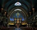
Notre Dame Montrealby srdanzComment by JunieMoon: I finally got back to return a comment which you were kind enough to leave on my Odd Moon. Anyway, I am surprised that this one has not received any comments. It is a beautiful photo. I love the crop on this one. Nice leading lines into it with the carpet. I know it is my monitor, but it does look a little dark around the edges. Maybe with a little dodging (not much, maybe about 16%) the roof contrast might become slighly more noticable. Overall, I think you did a wonderful job on this one. I am going on sabbatical for a few months, so won't be around much. Hope to see more of your fine work. Message edited by author 2005-11-30 11:31:51. |
| Photographer found comment helpful. |
| 11/30/2005 09:25:18 AM |
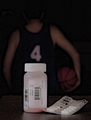
Performance Enhancementby srdanzComment by CEJ:
I was prepared to give an in-depth critique of this image, however, I see that someone has already given you one with good points, observations and suggestions. If you still would like an additional critique, PM me and I will return to this image. Message edited by HBunch - removed Critique Club status. |
| Photographer found comment helpful. |
| 11/28/2005 09:15:03 PM |
|
| Photographer found comment helpful. |
| 11/28/2005 09:01:07 AM |
Performance Enhancementby srdanzComment by glad2badad: Srdanz - I almost wonder if the message got lost with the global community here at DPC? I think it's a great idea and certainly shouts "Cheater" - has been lots of publicity about it in US papers for sure. I like the composition, the only down side I have is I think you went a tad too dark for the basketball player. Monitor calibration is an issue here at DPC, and many voters may have had a hard time with this. Just a thought.
Smile and keep having fun! ;^) |
| Photographer found comment helpful. |
| 11/28/2005 01:59:10 AM |
Performance Enhancementby srdanzComment by Bear_Music: Comparing the two images, can you see how you have given away nearly all of the luminosity of the original int he version you entered? I think this cost you a point or so, myself; the entered image is just so "dull", speaking in terms of tonalities. I suspect pulling the head out of the BG just a tad by dodging might have helped as well. It's a good concept and competent execution, but it's so murky, you know? That rarely works in DPC, where internal contrast is king. |
| Photographer found comment helpful. |
Home -
Challenges -
Community -
League -
Photos -
Cameras -
Lenses -
Learn -
Help -
Terms of Use -
Privacy -
Top ^
DPChallenge, and website content and design, Copyright © 2001-2026 Challenging Technologies, LLC.
All digital photo copyrights belong to the photographers and may not be used without permission.
Current Server Time: 07/17/2026 11:57:33 PM EDT.