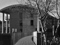
DPChallenge: A Digital Photography Contest You are not logged in. (log in or register
 
Browse Settings
Currently viewing:
Registered Usersigrun_th

Show comments:

Per page:

Order:

Comments:


Comments Received by sigrun_th
Pages:   ... [195] [196] [197] [198] [199] [200] [201] ... [231]
Showing 1971 - 1980 of ~2301
Image Comment
Melody in Blue
11/14/2005 06:24:35 PM
Melody in Blue
by sigrun_th

Comment by keone:
Very calming.
Photographer found comment helpful.
Melody in Blue
11/14/2005 04:25:52 PM
Melody in Blue
by sigrun_th

Comment by saracat:
Vertical borders are a little heavy, but otherwise very nice.
Photographer found comment helpful.
Melody in Blue
11/14/2005 03:21:27 PM
Melody in Blue
by sigrun_th

Comment by puzzled:
This really is a melody - I like it a lot. Love how you've made the frame resemble a film negative.
Photographer found comment helpful.
Melody in Blue
11/14/2005 11:58:08 AM
Melody in Blue
by sigrun_th

Comment by bob_bobski:
Lovely looking shots. Meets / beats challenge, great 9
Photographer found comment helpful.
Melody in Blue
11/14/2005 10:01:18 AM
Melody in Blue
by sigrun_th

Comment by rscorp:
Great image. All three are nicely composed, perfectly exposed and have nice color. Nice choice for the center photo. Beautiful work.
Photographer found comment helpful.
Melody in Blue
11/14/2005 01:38:39 AM
Melody in Blue
by sigrun_th

Comment by rachelellen:
I am a sucker for misty water shots. These are very pretty, and go well together.
Photographer found comment helpful.
Melody in Blue
11/14/2005 12:41:42 AM
Melody in Blue
by sigrun_th

Comment by Sammie:
Very lovely.
Photographer found comment helpful.
Wide View
11/04/2005 12:47:19 PM
Wide View
by sigrun_th

Comment by CEJ:
Hello from the Critique Club!

First - this is a stunning image! How can I critique something so beautiful!

Composition/perspective - the distance relationship, front to back, in this image is excellent. The small hint of higher mountains in the background is real nice and adds to the overall expansive feeling of the shot. The grasses in the forground, to me, almost act as a leading line drawing you to the horizon on the left which then sweeps you right across the image to the object I see as your subject - the house. Placement of the house and it being the only one in the shot help to create the mood of the shot quite nicely. Your timing of the shot was quite good - the clouds almost seem as though you placed them there on purpose. The image is crisp and very clean. Black and white was the perfect choice for this although I think it could be just as strong if in color. The crop also adds to the quality of the image.

Color - well, it is b/w. However, you have processed it to maximize the various shades of gray quite nicely. For a black and white image this has a very rich palette.

Lighting - natural of course...the sky is where I would look for problems here and I see none. Even all the way to the back where you would expect more blending, you got the exposure just right to allow all the elements and details stay in the image.

Challenge requirements - the crop helps to add to the 'wide angle' aspect of the shot, but even a taller crop would not have hurt it. Following the horizon across the image in either direction you can feel yourself travelling the distance. It definitely meets the challenge requirements.

Overall/my opinion - I was a little intimidated by critiquing this shot. It is exactly the kind of shot I strive to be able to produce. Your talented eye is very apparent in this image and your control of the conditions around you with your camera is clearly evident. VERY WELL DONE!

Message edited by author 2005-11-05 09:00:54.
Photographer found comment helpful.
Grainy Image
11/03/2005 03:19:59 PM
Grainy Image
by sigrun_th

Comment by sigrun_th:
Thank you. "The small white patch on the left side of the railing" is a bird sitting there.
Grainy Image
11/03/2005 11:12:06 AM
Grainy Image
by sigrun_th

Comment by CEJ:
Hello from the Critique Club!

This is an interesting image in many respects - the grain in an image of a modern building, the visual detachment the walkway creates, the time of day/natural lighting choice.

Composition/perspective - the distance from the main subject is good and the balance between the subject and its surroundings adds to the feeling of detachment mentioned above. The walkway is only slightly off center which is ok since the slight bend on the walkway makes it work quite nicely. The angle of approach is good, but in my opinion a slightly different approach would have helped. By that I mean everything seems one sided and straight on. Moving a little farther back and slightly to the left you could still have the walkway in the current placement but the small portion of the roof in the upper left would not be cut off. Different on the other side since there are trees and such to fill the shot. It is just that the columns are supporting the roof and it would have been nice to let it show the corner and emphasize that aspect. I think this also would help eliminate the minor distraction of the building behind the columns. Your focus would remain in the foreground and not drift to the background. The slightly different placement would also allow the tree in the foreground to not block as much of the view of the building. It is not really a distraction, but it blocks the nice slope line of the roof.

Black and white was a good choice. It allows the building to appear strong without revealing the detail of the materials used in the construction - stone/concrete?? This also allows the grain to add to the image and not detract from it.

Challenge requirements - your application of noise/grain was done very well. It helps tone down the sunlight as well as add an element of wonder - a grainy image of a modern building. I think it works, though, that you did not go for an older subject to try and mimic an older photo. It helps that it has been applied in a uniform amount over the whole image. Again, well done.

Overall I think this image presents a serene setting in what appears to be a busy area - the closeness of the buildings, the walkway with no pedestrians, the lack of lights in the windows. It makes me think this was either shot at the beginning or the end of a workday or perhaps early morning while people are still sleeping. It sets a nice mood.

The only negative I can find is the small white patch on the left side of the railing. Not sure what it is - a bird or reflection in the window?? As I review the image I find myself looking to try and determine what it is. it is only a minor distraction, but it could have been removed.

Overall nice capture and good post processing.
Photographer found comment helpful.
Pages:   ... [195] [196] [197] [198] [199] [200] [201] ... [231]
Showing 1971 - 1980 of ~2301


Home - Challenges - Community - League - Photos - Cameras - Lenses - Learn - Help - Terms of Use - Privacy - Top ^
DPChallenge, and website content and design, Copyright © 2001-2025 Challenging Technologies, LLC.
All digital photo copyrights belong to the photographers and may not be used without permission.
Current Server Time: 06/19/2025 08:01:54 AM EDT.