Remembranceby
sigrun_thComment by CEJ: Hello from the Critique Club!
I have studied your image and have the following to offer:
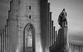
Composition/perspective - this is a very strong composition. Placement of the two main subjects is very well done and follows nicely the rule of thirds. The feeling of depth/distance is created very nicely with the perspective applied. Although the front subject appears raised higher because of the slope of the building, being dwarfed by the facade is an extremely interesting effect. The image appears a bit oversharpened as evidenced by the apparent halo around the statue on the right side - this could also be facility lighting like appears in the background, hard to tell. The rest of the image does not show this. The shape of the building itself acts like a leading line along the top edge which just draws you across the image.
Color - b/w, accentuated very nicely with the natural textures and smoothness. The stone facade and walls are a strong contrast to the sky which appears to just be sweeping on by. The accents keep them nicely separated and working together.
Lighting - very nice combination of time of day - natural light and facility lights. No blown out or really dark areas to be distracting.
Challenge requirements - this might be where this image fell short. I don't really get a sense of celebration from this. Victory, perhaps. But more of a darker feeling for some reason.
Overall/my opinion - a very strong image with excellent composition. Black and white processing is perfect. Not sure about the connection to the challenge, but still an excellent picture.
EDIT: typos
Message edited by author 2005-11-22 15:22:56.