| Image |
Comment |
| 06/25/2006 01:49:00 AM |
|
| 06/12/2006 12:03:19 PM |
Birta Lífby sigrun_thComment by gsal: This is good. Timeless. Could be from the last century! Mjög íslensk mynd. |
 Photographer found comment helpful. Photographer found comment helpful. |
| 06/10/2006 10:07:46 PM |
heavenby sigrun_thComment by Ragga2000: Like this picture...nice to see this different angle you use... Like pictures that are taken from a low point of view... Very nice sky and color. :o) Mjög flott mynd. |
| Photographer found comment helpful. |
| 06/07/2006 08:04:50 PM |
Sightby sigrun_thComment by fotomann_forever: ::: Greetings from Critique Club :::
Hi, as requested, here is an indepth critique of your submission.
First Impression - the most important one:
Nice hi-key shot. I like it.
Composition:
I'd like to see a bit more negative space in this image. Loosen the crop some and move the eye to a stronger part of the composition.
Subject:
It's an eye. It's right there. Can't miss it :-)
Technical (Color, focus, and light):
Color and focus look good.
Light is nice. I'd like to see it about a half a stop more to completely blow the highlights on the forehead.
To grow its vote?:
Clumps in the eyelashes stand out to me. I'm no makeup artist, so I don't know how to fix that. Also, I think the eye-liner could be darker.
Summary:
Cool shot, very punchy. Good work.
Hope to see more from you soon,
Leroy |
| Photographer found comment helpful. |
| 06/07/2006 01:29:01 PM |
Eggby sigrun_thComment by SandyP: Wow! I LOVE this! I have always loved these white on white photos and this one is composed and executed so well!! |
| Photographer found comment helpful. |
| 06/06/2006 09:39:00 PM |
Sightby sigrun_thComment by Louison: Much detail is lost in the overexposure, but this still has some punch. Interesting. |
| Photographer found comment helpful. |
| 06/06/2006 04:35:12 PM |
|
| Photographer found comment helpful. |
| 06/06/2006 04:24:12 AM |
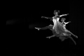
Perfect Take Off by sigrun_thComment by HBunch: *Critique Club*
Hi there. The fist thing I notice is the negative space. I think it works very well here to enhance the visual appeal of the image. They are leaping into the photo...very nice. I do notice a couple light areas in the background/negative space, right in front of the dancers. Not sure if this was something in the background that was slightly illuminated, or what it is.
This is really a beautiful image, proven by the score and placing in the challenge.
I like the simplicity of it really. Very nice crisp focus helps us to get a lot of detail in the dancers, and that is great.
Also, the lighting works well too. I like how they are almost outlined by light. Nice black and white. I find that it works very well here.
Not much more to say, I think you hit the nail on the head with this shot. My only suggestion/complaint are those light areas of the background. They do appear odd. Not sure if some contrast/curves adjustments might help that...but outside the challenge, you could definately do some cloning on them.
~Heather~ |
| Photographer found comment helpful. |
| 06/05/2006 10:39:11 PM |
|
| Photographer found comment helpful. |
| 06/05/2006 09:48:10 PM |
|
| Photographer found comment helpful. |
Home -
Challenges -
Community -
League -
Photos -
Cameras -
Lenses -
Learn -
Help -
Terms of Use -
Privacy -
Top ^
DPChallenge, and website content and design, Copyright © 2001-2026 Challenging Technologies, LLC.
All digital photo copyrights belong to the photographers and may not be used without permission.
Current Server Time: 06/23/2026 11:28:05 AM EDT.