| Image |
Comment |
| 01/18/2006 08:44:55 PM |
|
 Photographer found comment helpful. Photographer found comment helpful. |
| 01/18/2006 01:08:30 AM |
|
| Photographer found comment helpful. |
| 01/16/2006 09:06:53 PM |
|
| Photographer found comment helpful. |
| 01/11/2006 07:02:06 PM |
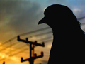
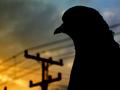
Pigeon Headedby briantammyComment by macrothing: Unusual silhouette. The colors and lines in the background add to this in my opinion. Perhaps a little 'zoomed out' may have given this more impact, not sure. Also, whilst difficult to achieve, a fraction more detail in the edge of the silhouette/feathers, may have also given this something extra, in my opinion.
|
| Photographer found comment helpful. |
| 01/10/2006 06:32:17 AM |
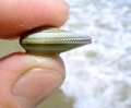
shell at huntingtonby briantammyComment by macrothing: Nice, and 'unusual' (with the finger pads/prints) macro. Nice detail in the shell and good simple background.
temporary note #1: Re my previous comment on this 'shell at huntingdon' shot, I did try to 'rip it apart' (as I normally try to do), but there wasn't much to 'criticize' (constructively of course) with it, perhaps that is why you did not 'check the box', so not an issue. However on 2nd 'review', this is about the 'best' I can do to 'pull/rip this apart' (aka 'constructive criticism'); I guess it borders on a personal type shot in some respect, re the 'fingers', but minor. It is not so 'personal' that it could not be used 'commercially', in other words, a 'quality shot', in my opinion. Maybe a crop variation, especially bottom left near the nail, but minor. There is a little 'glare'/reflection here and there, but I actually think it adds to the shot. Perhaps 'more space' between the shell/fingers and the background for added depth, but again, works well as is so who knows.
Message edited by author 2006-01-11 19:56:06. |
| Photographer found comment helpful. |
| 12/27/2005 12:09:37 PM |
|
| Photographer found comment helpful. |
| 12/27/2005 09:21:59 AM |
|
| Photographer found comment helpful. |
| 12/26/2005 07:22:30 PM |
|
| Photographer found comment helpful. |
| 12/26/2005 01:49:56 PM |
|
| Photographer found comment helpful. |
| 12/26/2005 08:44:34 AM |
|
| Photographer found comment helpful. |
Home -
Challenges -
Community -
League -
Photos -
Cameras -
Lenses -
Learn -
Help -
Terms of Use -
Privacy -
Top ^
DPChallenge, and website content and design, Copyright © 2001-2026 Challenging Technologies, LLC.
All digital photo copyrights belong to the photographers and may not be used without permission.
Current Server Time: 07/17/2026 12:56:00 AM EDT.