| Image |
Comment |
| 09/26/2005 08:20:24 PM |
Rob2web.jpgby eschelarComment by Tammer: This made me laugh. I like the composition and colors. I might take a bit of the blue saturation down from the background, but a really fun photo. |
 Photographer found comment helpful. Photographer found comment helpful. |
| 09/26/2005 08:17:27 PM |
|
| Photographer found comment helpful. |
| 09/26/2005 04:11:47 PM |
tina2smirk.jpgby eschelarComment by taterbug: Sweet looking little girl. I like the pose and your composition/framing. Looks pretty good, but might try just a little tweaking in editing. Maybe try and get just a little brighter. |
| Photographer found comment helpful. |
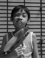
| 09/26/2005 04:08:01 PM |
RyanWANTEDweb.jpgby eschelarComment by taterbug: Cute shot. Love his expression! For the 'wanted poster' look you're going for, I think the centered comp works well, although I think it would be strengthened by being actually more centered. As it is now, the frame is close on his right side, and some space on his left. What I'm saying is, center him within the frame, and also if he were centered against the vertical lines on the background. |
| Photographer found comment helpful. |
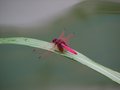
| 09/26/2005 04:01:51 PM |
DragonFlyWeb_0008.jpgby eschelarComment by taterbug: Great subject. That is a spectacular color! The shallow dof does work, but I agree with tsheets, maybe just a wee bit more, not losing the bokeh, but just get a little bit more definition in the background. And I would definitely say in this case to get him out of the center :-) Ideally, I would say it would be great compositionally if he were at the lower right thirds intersection, looking into the shot. Bonus if that were to show the end of the leaf, which makes a nice leading line across the photo. |
| Photographer found comment helpful. |
| 09/26/2005 03:56:06 PM |
Football-MANweb.jpgby eschelarComment by taterbug: Good action capture. I like the slight blur on the feet, adds to the action feeling. I agree, the crop seems a little tight, but it helps that the subject is looking back into the image, where there is a little space, although the action does want to take you off the image, since he is so close to the edge. Color is pretty good, I like the nice warm tone of the photo. I don't know if you edited the shot much, but I might try to get a little bit more contrast, might add a touch of depth. |
| Photographer found comment helpful. |
| 09/26/2005 02:21:25 PM |
tina1web.jpgby eschelarComment by tsheets: Maybe try some dodging and USM to bring out the eyes. Looks like the focus point might have been her shoulder. Nice soft feel, and if you can bring some more sharpness and attention to her eyes, that may make a big difference.
Nice capture. |
| Photographer found comment helpful. |
| 09/26/2005 02:14:39 PM |
DragonFlyWeb_0008.jpgby eschelarComment by tsheets: Interesting dragonfly. I don't think I've ever seen one this color. Really shallow DOF. Actually, I wouldn't mind a bit more depth if the background isn't too distracting. Definitely, crop in closer..try getting rid of the right 3rd of the frame, and about 20% off the bottom to start with, and go from there. |
| Photographer found comment helpful. |
| 09/26/2005 02:11:22 PM |
|
| Photographer found comment helpful. |
| 09/26/2005 02:09:24 PM |
tina1web.jpgby eschelarComment by mandyturner: this is a nice shot. I would try blurring out the background and then lighten her face a little, there are a few harsh shadows. Cute kid!! |
| Photographer found comment helpful. |
Home -
Challenges -
Community -
League -
Photos -
Cameras -
Lenses -
Learn -
Help -
Terms of Use -
Privacy -
Top ^
DPChallenge, and website content and design, Copyright © 2001-2026 Challenging Technologies, LLC.
All digital photo copyrights belong to the photographers and may not be used without permission.
Current Server Time: 07/15/2026 07:46:41 PM EDT.