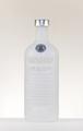
DPChallenge: A Digital Photography Contest You are not logged in. (log in or register
 
Browse Settings
Currently viewing:
Registered Usermilo655321

Show comments:

Per page:

Order:

Comments:


Comments Received by milo655321
Pages:   ... ...
Showing 391 - 400 of ~455
Image Comment
Absolut White Redux
03/02/2005 09:02:44 AM
Absolut White Redux
by milo655321

Comment by hannafate:
the lighting is pretty flat, although I like the idea.
Photographer found comment helpful.
Absolut White Redux
03/02/2005 08:07:20 AM
Absolut White Redux
by milo655321

Comment by nordicgirl:
Very nice lights and tones of colors...
Photographer found comment helpful.
Absolut White Redux
03/02/2005 05:46:27 AM
Absolut White Redux
by milo655321

Comment by gtp1164:
i never had this kind.. is it good... 8
Photographer found comment helpful.
Absolut White
03/02/2005 04:29:35 AM
Absolut White
by milo655321

Comment by md8speed:
The shadow in the foreground is a little distracting and it is difficult to read the bottle clearly.
Photographer found comment helpful.
Absolut White Redux
03/02/2005 12:35:42 AM
Absolut White Redux
by milo655321

Comment by xonkas:
I think i have seen something very familiar before...
Absolut White
03/01/2005 10:40:01 AM
Absolut White
by milo655321

Comment by kearock:
A little bright...I'd like to see more of the bottle.
Photographer found comment helpful.
Absolut White
03/01/2005 07:50:46 AM
Absolut White
by milo655321

Comment by Skip:
oouuu, i'm telling! you put TEXT on your entry. i'm deducting one point for each letter! you're just luck that your dimensions are the RECOMMENDED 640x320; otherwise i would deduct a point for each pixel off. so, let's see what you get: 10 - 12 = -2!

--- ok, following is two more comments, a general one, then a specific one ------
ok, i am voting this challenge in 2 passes. in this pass, you will get a partial comment and a score. then i will come back to comment again. if you have any problem whatsoever with this comment, pm me and let me know. otherwise, take it with a grain of salt...i'm not trying to be a know-it-all, i'm just explaining where i'm coming from in voting this challenge. and, if this comment is NOT helpful (of if you think i'm full of $#!+), don't mark it helpful.

billboards are a science unto themselves. a lot of research has gone into determining just how much information a person can digest and retain in specific time spans. they use this information to develop formulas for determining the number of words and letters to use on billboards, as well as their sizes. they also determine the size and number of visual elements to include.

the graphics/photograph on a billboard are designed to get the point across in a moment. on the road, a driver will have less time with a billboard than a voter will give your image. this is a key element in the challenge: composing a shot that will get its point across quickly and succintly. along those lines, a strong composition will probably have few details and make strong use of negative space.
----------------------
great billboard! not to keen about your choice of fonts, but that's nit-picking. i also think you know you could have saved yourself a lot of anguish by leaving out the text...the image by itself works perfectly. [as an aside, along the lines of 'billboard rules', they are typically laid out graphic on the left, text on the right.] hope you aren't getting beaten up too badly!
Photographer found comment helpful.
34D  Vultures were sacred to him
02/28/2005 02:35:51 PM
34D Vultures were sacred to him
by milo655321

Comment by Mr_Pants:
How many letters?

Perhaps a little more sharpening to really bring out the detail in the pencil.
Photographer found comment helpful.
34D  Vultures were sacred to him
02/28/2005 02:02:38 PM
34D Vultures were sacred to him
by milo655321

Comment by utro:
39D is dose. I'm a crossword addict. Nice clear shot.
Photographer found comment helpful.
Absolut White
02/28/2005 01:55:47 PM
Absolut White
by milo655321

Comment by typologic:
Good effort, but the text just seems out of place. Maybe a different arrangement or placement would have worked better.
As far as the bottle goes, the product name needs to stand out way more. Other than that, I like the high key background and simple composition.
Photographer found comment helpful.
Pages:   ... ...
Showing 391 - 400 of ~455


Home - Challenges - Community - League - Photos - Cameras - Lenses - Learn - Help - Terms of Use - Privacy - Top ^
DPChallenge, and website content and design, Copyright © 2001-2025 Challenging Technologies, LLC.
All digital photo copyrights belong to the photographers and may not be used without permission.
Current Server Time: 08/22/2025 03:42:09 PM EDT.