The Holeby
GiorgioBaruffiComment by jasonlprice: Greetings from the Critique Club
I was assigned this photo last week, but am new to the critique club and didn’t realize there was a time limit once a photo was assigned. I wrote a critique but it was too late so I’ll go ahead and just post it here anyway.
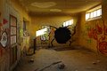
I am glad that I was assigned this photo: I gave it an 8 during voting but didn’t make a comment. This fascinating story is captured wonderfully with the natural light. I love the “fruit of the loom” looking creature that has created “The Hole” and it sends my mind off in many different directions…What happened to the poor fruit, what is it trying to tell us, just what has taken place here, why is that packman looking light pattern chasing it???? Well, that was my first thoughts on the photo anyway and now on to some of the technical aspects.
I love the color scheme in this photo, the red and green ink as well as the orange cast walls and light blues creates great contrast (complementary colors which are across from each other on the color wheel will do that). I also like the overall balance. There is just enough graphics on the left side to balance the right and the symmetry is great. Your correction of the lens distortion is great. The overall tonal range is wonderful as well.
I think a boost in the overall value or lightness of the scene would have made this score better (possibly). If it were me and since this was advanced editing I would have used a more aggressive curves adjustment (taking “The Hole” down some and bringing the highlights up). I would have then masked that layer and selectively dodged and burned with it to give it "pop". There is an overall "dullness" to the tones that in my humble opinion kept this one below 6.
I personally like your edit and is why my vote was higher than average, but I’m just saying what I think was lacking for the "normal" voters.