| Image |
Comment |
| 01/10/2005 03:04:38 PM |
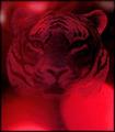
Shadows of Redby ace flymanComment by tristalisk: ok this was my lowest scoring photo and I feel I owe it to you to at least explain why I feel this. First it looks like a photo of a carpet with a tiger on it. I would Have prefered a less flat image. Brokeh the only subject matter is the background at it being out of focus definately does not enhance the image. I have no clue what or why the red lights are so overpowering. They seem to serve no purpose, and do not flatter or enhance the tiger in the background. I don't intend to be insulting but if a low score is given I feel I should atleast try to explain my reasoning. |
 Photographer found comment helpful. Photographer found comment helpful. |
| 01/09/2005 09:46:28 PM |
|
| Photographer found comment helpful. |
| 01/09/2005 12:16:24 PM |
|
| Photographer found comment helpful. |
| 01/09/2005 10:13:44 AM |
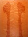
"Thing One and Thing Two"by ace flymanComment by Travis99: From the Critique Club.
Simple images like this do not work on DPC. The image is flat, depth is a highly enhancing feature to a photgraph. The light from your flash is to powerful. The straight on look does not work either. The image does have a title that fits.
It could be inproved by changing the angle, try shooting tlaying on the ground looking up, or off to the side. As for the lighting I would recommend no flash. Try using a tripod for stability.
Travis |
| Photographer found comment helpful. |
| 01/08/2005 03:28:15 PM |
|
| Photographer found comment helpful. |
| 01/08/2005 12:02:10 PM |
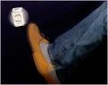
"No Where"by ace flymanComment by Arcanist: A little too light on the face for me, but otherwise a great image. I like the beveled edge effect before the border as it seems to push the eye inward. Could use a slight counterclockwsie rotation to line up the posts and windows. Their alignment seems to cause a slight falling effect towards the right and tips the balance a bit too heavily. a 7. |
| Photographer found comment helpful. |
| 01/07/2005 12:01:13 PM |
|
| Photographer found comment helpful. |
| 01/07/2005 02:32:12 AM |
"No Where"by ace flymanComment by clem: Nice use of short depth of field. Nice use of black and white. I like folds in the coat. |
| Photographer found comment helpful. |
| 01/06/2005 09:47:37 AM |
|
| Photographer found comment helpful. |
| 01/04/2005 04:18:34 PM |
"No Where"by ace flymanComment by snackwells: Position within frame very effective in conveying the message within your title. B&W treatment tastefully executed and nice DOF. I like the way your subject gazes away from the camera, as if lost. Nicely captured. |
| Photographer found comment helpful. |
Home -
Challenges -
Community -
League -
Photos -
Cameras -
Lenses -
Learn -
Help -
Terms of Use -
Privacy -
Top ^
DPChallenge, and website content and design, Copyright © 2001-2026 Challenging Technologies, LLC.
All digital photo copyrights belong to the photographers and may not be used without permission.
Current Server Time: 07/16/2026 04:12:04 PM EDT.