| Image |
Comment |
| 04/18/2005 05:16:11 PM |
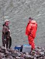
Fish Storyby ace flymanComment by love: fish story should have arms out wide ..but it's ok overall..faces are a bit too red and water dull 5 |
 Photographer found comment helpful. Photographer found comment helpful. |
| 04/18/2005 02:14:48 AM |
Old Farm Houseby ace flymanComment by Brad: Nice choice for B&W, though could have benefitted from being a little sharper.
Still a nice shot regardless. |
| Photographer found comment helpful. |
| 04/15/2005 03:03:04 PM |
Old Farm Houseby ace flymanComment by andri: I feel this framing is much too tight. One especially misses the rightmost part of the roof which is missing. In addition I'd love to see the rest of the tree on the right.
Actually I believe you should be much further away from the building and should have included the whole building in the shot together with its enviroment.
However, if you wanted to get a tight framing of the house I think it would have been better to shoot it straight on, either the front face or the side of the house.
I also notice you seem to have had a problem with sky as it is pure white on this photograph. Now, my picture in this entry had the same problem with the sky so I waited for a few days until the weather got better and went back for a reshoot. I don't know whether it was possible in your case but it is at least something to keep in mind for future shoots.
There is a tad too little contrast in the picture for my taste. Some use of levels, curves and unsharp mask (try 20%, 50.0 and 0 as a starting point) would have helped this pictured a lot. |
| Photographer found comment helpful. |
| 04/14/2005 07:48:18 AM |
Old Farm Houseby ace flymanComment by notonline: The contrast in this photo has made it look a little OoF. I also find that there is something blurry in the bottom right corner that is very distracting. Perhaps this building shot from a different angle would have done better for my vote. Good luck in this challenge. |
| Photographer found comment helpful. |
| 04/14/2005 04:59:00 AM |
|
| Photographer found comment helpful. |
| 04/12/2005 10:57:50 PM |
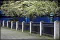
i 'sby ace flymanComment by mayer_chik83: nice shot... i like the water in the background... too bad the trees are in the way... like, if the background was a city skyline: wooty! this pic would rock! but i still like it :) |
| Photographer found comment helpful. |
| 04/12/2005 09:14:52 AM |
|
| Photographer found comment helpful. |
| 04/12/2005 03:46:29 AM |
|
| Photographer found comment helpful. |
| 04/10/2005 02:12:34 PM |
i 'sby ace flymanComment by pwm6: Nice perspective. I think the composition would be stronger if about 3/4 of the trees at the top were cropped off. |
| Photographer found comment helpful. |
| 04/09/2005 06:12:27 PM |
i 'sby ace flymanComment by gerimedic: Really lively mix of colour. The clarity is excellent and wonderfully composed. The light reflections accentuating the blue water in the middle of the photo. Great! |
| Photographer found comment helpful. |
Home -
Challenges -
Community -
League -
Photos -
Cameras -
Lenses -
Learn -
Help -
Terms of Use -
Privacy -
Top ^
DPChallenge, and website content and design, Copyright © 2001-2026 Challenging Technologies, LLC.
All digital photo copyrights belong to the photographers and may not be used without permission.
Current Server Time: 07/16/2026 05:40:51 AM EDT.