| Image |
Comment |
| 12/04/2004 03:46:25 AM |
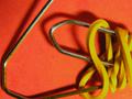
Rubber & Steelby phobdenComment by rkligman: Nothing terribly attractive here. The item is on top of the paper so it casts heavy shadows that do nothing to help it. |
| 12/03/2004 11:44:19 PM |
Rubber & Steelby phobdenComment by Neil: Yes, those are low tech office goods, nice color contrasts too. Works somewhat as a geometric abstract. But I think this could have been arranged and shot even more creatively. |
| 12/03/2004 05:29:45 PM |
Rubber & Steelby phobdenComment by typologic: Light from the flash was very harsh here. You may want to try natural light or a softer light source instead. |
| 11/30/2004 03:12:46 PM |
|
| 11/30/2004 01:51:23 PM |
|
| 11/30/2004 12:14:59 PM |
Rubber & Steelby phobdenComment by whatdewuc: Nice detail in this macro shot of low tech office supplies. While a nice tight crop works well i would have kept the bottom clip in frame. Good luck... |
| 11/30/2004 01:09:08 AM |
Rubber & Steelby phobdenComment by KDO: Nice contrast of textures and shapes, the rigid bends of the paperclip and the elegant curves of the rubberband complement each other well. I would like to see the shadow underneath the objects eliminated but not the shadow on th rubberband. This is a nice shot. |
| 11/14/2004 05:07:56 AM |
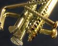
Threads & Headsby phobdenComment by carlos: A very difficult subject, pretty tricky to ligth right. you manage to remove many refrecting spots, but still some specially the one at the top right corner |
| 11/12/2004 05:16:14 PM |
Threads & Headsby phobdenComment by Konador: Its a shame about the over exposed area at the top right. Also, I think a white board would look better than on a mirror, as the reflections make the composition too comfusing. |
| 11/11/2004 09:48:58 PM |
|
Home -
Challenges -
Community -
League -
Photos -
Cameras -
Lenses -
Learn -
Help -
Terms of Use -
Privacy -
Top ^
DPChallenge, and website content and design, Copyright © 2001-2026 Challenging Technologies, LLC.
All digital photo copyrights belong to the photographers and may not be used without permission.
Current Server Time: 07/02/2026 10:39:27 PM EDT.