| Image |
Comment |
| 03/24/2006 01:13:33 PM |
|
| 03/24/2006 04:40:31 AM |
Eyes by librodoby chsmithComment by LalliSig: Sorry, not trying to offend you but this doesn´t even come close to the original, the only thing I see similar is a girl and a cloth around her head. The composition, post processing, expression on the girl and especially the lighting are MUCH better in his shot. This is hardly bad though, you just picked a really hard shot to imitate and I think I am being overly hard on you for that reason. I ended up giving this a 5. |
| 03/24/2006 02:12:27 AM |
Eyes by librodoby chsmithComment by hotpasta: that's a nice shot...i might have cropped a bit off the top to draw more attention to the eyes, also the shadow on the right eye covers it up a bit..good attempt 7 |
| 03/24/2006 12:13:48 AM |
Eyes by librodoby chsmithComment by Jutilda: I commented on this in the regular entries. Did you upload it to your portfolio too. YIKES - not supposed to do that. |
| 12/31/2005 10:51:31 AM |
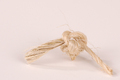
I'm afraid not...by chsmithComment by strangeghost: Greetings from the Critique Club
by strangeghost
COMPOSITION
Great use of negative space and placement of your subject. The shadows are soft and pleasing. Since the strands of "frayed knot" are key to your concept, I think your choice of backgrounds is less than ideal. The tones are so similar that some of the strands of fiber are barely visible against the BG. My choice for this image would have been either flat black or a vivid color to make the rope/knot really stand out and grab attention. As presented, it's a subtle image, not a hard hitting one. For a challenge like visual puns, I think you want to hit your viewer upside the head.
TECHNIQUE
Technical details look great. The knot is a very textured object and you've done a good job in capturing the texture. As mentioned above, the overall image is not very contrasty. I wonder what would have happened if you had tried to bump the contrast a little? Focus and depth are great.
OVERALL IMPACT
This is a technically excellent shot that failed to wow voters. Would any of my suggestions above have made a critical difference? I'm not sure. Your final score of 5.56 is above average, so you managed to please a majority of voters, but failed to stop them in their tracks. ... People obviously got your point - which is half the battle. A little more visual impact and you might have cracked six. |
| 12/24/2005 03:30:06 AM |
|
| 12/20/2005 12:26:28 PM |
|
| 12/20/2005 04:36:04 AM |
|
| 12/20/2005 02:54:06 AM |
|
| 12/19/2005 08:43:14 AM |
|
Home -
Challenges -
Community -
League -
Photos -
Cameras -
Lenses -
Learn -
Help -
Terms of Use -
Privacy -
Top ^
DPChallenge, and website content and design, Copyright © 2001-2026 Challenging Technologies, LLC.
All digital photo copyrights belong to the photographers and may not be used without permission.
Current Server Time: 07/16/2026 12:39:25 AM EDT.