| Image |
Comment |
| 09/11/2005 07:24:14 PM |
|
 Photographer found comment helpful. Photographer found comment helpful. |
| 09/11/2005 11:17:11 AM |
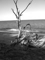
Wild Woodby jrjrComment by eschelar: Hmmm. Close to great. A slightly different composition might have helped this one. Particularly on the sliced top end. Looks good though, keep up the work on this technique.
I think partly the harsh shadows and lighting are a bit distracting as is the slightly odd interaction between beach tide line and horizon. |
| Photographer found comment helpful. |
| 09/10/2005 01:19:07 AM |
|
| Photographer found comment helpful. |
| 09/09/2005 02:04:30 PM |
Wild Woodby jrjrComment by Bethan: Would have gotten a 10 from me if the horizon had been straight......:( |
| Photographer found comment helpful. |
| 09/09/2005 09:18:42 AM |
Wild Woodby jrjrComment by blue_dragon: Oh come on! Is it _SO_ hard to rotate photograph a few degrees right so that horizont doesn't hang? |
| Photographer found comment helpful. |
| 09/09/2005 09:09:28 AM |
Wild Woodby jrjrComment by dahkota: I would have preferred a less tight crop. It would give the image breathing room. I like the tones. Horizon slightly off - with a line that straight and that noticible, you need to take care. Lighting provides texture. |
| Photographer found comment helpful. |
| 09/09/2005 06:53:05 AM |
Wild Woodby jrjrComment by ankit0621: Excellent shot, just one thing its not horizontal. This picutre has great potential however better planning would have giving it a good score. once again beautiful shot. |
| Photographer found comment helpful. |
| 09/08/2005 08:48:26 PM |
|
| Photographer found comment helpful. |
| 09/08/2005 04:28:19 PM |
Wild Woodby jrjrComment by ecdillon: Very dramatic branch to photograph. The tilt to the horizon is distracting to me, but can be easily fixed. I also might have liked to have more space at the top of the image so we can see the ends of the branches and they don't get cropped off. |
| Photographer found comment helpful. |
| 09/08/2005 01:46:37 PM |
Wild Woodby jrjrComment by BrennanOB: AAch. the dreaded tilted horizon! I have been crushed for this same flaw so you have my sympathy. To my mind a greater eror is it looks like this was edited to print rather than for the screen where the tonal range is too narrow to show off all the dark tones in the shadows. If you had dodged out some more detail it would have scored better. I like the Westonesque vibe, of course he would have closed in on one element, but the feel is similar
|
| Photographer found comment helpful. |
Home -
Challenges -
Community -
League -
Photos -
Cameras -
Lenses -
Learn -
Help -
Terms of Use -
Privacy -
Top ^
DPChallenge, and website content and design, Copyright © 2001-2026 Challenging Technologies, LLC.
All digital photo copyrights belong to the photographers and may not be used without permission.
Current Server Time: 06/21/2026 12:42:23 AM EDT.