| Image |
Comment |
| 01/25/2003 07:38:20 PM |
|
| 01/25/2003 04:30:06 PM |
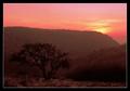
In the Mendip Hillsby KonadorComment by psychephylax: A visit from the critique club :)
Hey Ben, I think this photo is excellent. I think this has very strong composition. The diagonal curves in the hills are excellent. What's even better is that you have the dominant top line going into the smaller one on the right which in turn leads to the solitary tree placed with the rule of 3rds. The sun is great for color and I particularly love the muted color in the hill towards the back.
You also did not place the horizon in the center giving the photo more strength. I like the detail in the foreground as well.
One thing I do think could be done a little better is exposure. It seems that you underexposed this a little bit (intenionally?). On one hand it plays well with the composition giving you specific cues to follow with your eye but in the end, when you arrive at the final destination of the tree it looks a bit dark. Perhaps a slightly longer exposure would have resulted in a much stronger foreground. |
 Photographer found comment helpful. Photographer found comment helpful. |
| 01/25/2003 10:53:59 AM |
|
| 01/24/2003 12:36:23 PM |
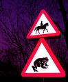
Beware of the Giant Toadby KonadorComment by Swashbuckler: That is just a killer sign! I like the extra purple, makes for a dramatic sky (and it didn't hurt the caution signs either). Technical issues..none, very good focus, framing and exposure. I just plain like this shot. 9 Swash |
| Photographer found comment helpful. |
| 01/24/2003 12:46:27 AM |
|
| 01/23/2003 11:01:31 PM |
|
| 01/23/2003 06:38:49 PM |
|
| 01/23/2003 01:55:57 PM |
|
| 01/23/2003 11:22:56 AM |
|
| 01/23/2003 06:41:06 AM |
Beware of the Giant Toadby KonadorComment by Harz_Joerg: LOL, a wonderful combination of the two road signs. Even without reading the size mismatch is the first thing I noticed. I like the color and darkness of the background: it's more like a surface on which the main-objects rest. Like in a studio-shot with colored and textured background.
Because you probably used the flash, the sign appear a little flat, more like a graphic rather then a real life object. I can't say if this is good or bad.
Good luck to you.
|
| Photographer found comment helpful. |
Home -
Challenges -
Community -
League -
Photos -
Cameras -
Lenses -
Learn -
Help -
Terms of Use -
Privacy -
Top ^
DPChallenge, and website content and design, Copyright © 2001-2026 Challenging Technologies, LLC.
All digital photo copyrights belong to the photographers and may not be used without permission.
Current Server Time: 07/19/2026 03:37:53 PM EDT.