| Image |
Comment |
| 12/01/2003 06:52:35 AM |
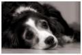
J'adoreby KonadorComment by brianlh: beautiful dog and tones. with this composition, it's one of my favorites in this challenge - the empty space on the right gives the dog room to gaze into, and the soft focus provides a "dreamy" effect that's very suitable for this shot. creative. |
 Photographer found comment helpful. Photographer found comment helpful. |
| 12/01/2003 04:01:18 AM |
J'adoreby KonadorComment by robsmith: So you're going for the "Ah, it's he cute vote", good use of soft focus though :P |
| Photographer found comment helpful. |
| 12/01/2003 03:56:05 AM |
J'adoreby KonadorComment by Natator: Wow, talk about puppy dog eyes! Lovely shot and the soft focus is great. |
| Photographer found comment helpful. |
| 12/01/2003 12:35:32 AM |
|
| Photographer found comment helpful. |
| 11/30/2003 11:30:14 PM |
|
| Photographer found comment helpful. |
| 11/30/2003 08:57:56 AM |
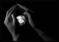
Warmthby KonadorComment by lilnukee: This is my favorite picture, I hope to see a blue ribbon next to it next week. |
| Photographer found comment helpful. |
| 11/29/2003 08:25:28 PM |
Warmthby KonadorComment by Natator: Lighting is lovely and overall I love this shot. Just wondering though is colour might have given it a warmer feel, in line with the title (very minor critism though). great shot. |
| Photographer found comment helpful. |
| 11/29/2003 07:08:02 PM |
Warmthby KonadorComment by Azrifel: Good photo. Excellent exposure & toning. Interesting subject and composition, good job on the lighting; I especially like it how you chose a shutter time that didn't let the candle flame blow out the highlights of itself and its surroundings. The detail within the hands is therefore very good.
This would perhaps also do very good in a 1:1 aspect ratio. Nice scene for a Medium Format camera. |
| Photographer found comment helpful. |
| 11/29/2003 03:08:23 PM |
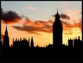
What's the Point?by KonadorComment by jmsetzler: Ben, this is good work as usual :) I think that if you crop about half of the dark area of the bottom, it works nicely also :) |
| Photographer found comment helpful. |
| 11/29/2003 01:44:02 PM |
What's the Point?by KonadorComment by dr rick: Greetings from the Critique Club!
To me, it is the repetition of the pointed towers that really makes this photo interesting. Of course, the beautiful sunset-lit clouds help too. I also like the light coming through open areas in the towers. To me the center of interest is the building with all the small towers (parliament?), not the clock tower which, though larger, isn't as interesting in silhouette. From your comments that wasn't your intent, but it doesn't affect the impact or quality of the image. Exposure, focus, and post-processing are all perfect.
One nit: To me, the photo seems slightly tilted to the right. It isn't; Big Ben is perfectly vertical in this image! But the silhouette removes the depth cues that indicate the rooftops are slanted because of perspective, making them seem tilted. A slight counter-clockwise rotation might make the image look straighter. |
| Photographer found comment helpful. |
Home -
Challenges -
Community -
League -
Photos -
Cameras -
Lenses -
Learn -
Help -
Terms of Use -
Privacy -
Top ^
DPChallenge, and website content and design, Copyright © 2001-2026 Challenging Technologies, LLC.
All digital photo copyrights belong to the photographers and may not be used without permission.
Current Server Time: 07/27/2026 12:56:42 AM EDT.