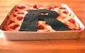
DPChallenge: A Digital Photography Contest You are not logged in. (log in or register
 
Browse Settings
Currently viewing:
Registered Usercamelotnorth

Show comments:

Per page:

Order:

Comments:


Comments Received by camelotnorth
Pages:   ... [74] [75] [76] [77] [78] [79] [80] ... [132]
Showing 761 - 770 of ~1316
Image Comment
My Pi(e) are squared.
04/16/2003 10:10:04 PM
My Pi(e) are squared.
by camelotnorth

Comment by rmahan:
This is quite a creative idea for the interpretation of "Pi". Almost every school kid knows "Pi R Squared" and there have been many jokes made about it. You created a picture to match the words. I often find it hard to say that someone doesn't meet a challenge because the idea is that each photographer produces THEIR interpretation ... the question is whether a viewer can connect to that interpretation or not. In this case, I think your communication is loud and clear and, in my opinion, this meets the challenge quite well.

Now for some things which, in my opinion, could improve your photograph:

Composition: I personally would have cropped this picture differently. The left-to-right cropping is slightly unbalanced and the top-to-bottom cropping makes me feel that I'm bumping up against the top of the picture. I would like to see centered cropping left-to-right and to have some more "breathing room" at the top and sides of the photograph even at the expense of making the subject slightly smaller.

Technical: I see a focus problem here or maybe more like a depth of field problem. It looks like a delicious pie and I would like to relish it from front to back. I would like to see every flake of that crust and that requires a much greater depth of field. The right-hand side of the pan is "blown out" as well as the left, front corner. The "R" appears to be made of felt and I would like to see less detail in the material. These are distracting elements which generally can be corrected by exposure control. I have to agree with some of the comments, too, that the angle of the shot might have been better had the camera been at a higher angle to the subject. Notice that the "R", when viewed as a flat object (which it is in a photograph) is smaller at the top than at the bottom. A steeper angle would have moderated this effect.

Lighting: I don't know what your lighting source was but you might have used something like a white sheet to diffuse the light and make it more even. Except for the two hot spots I mentioned, it is pretty good.

So now that I've drooled over this photograph so long, I'm off to the kitchen to see what I can scrounge up ... I don't think I'll find anything as delicious as what you've portrayed, though. Thanks for sharing it with us.

Regards ... for the Critique Club,

Bob Mahan
(rmahan)
Photographer found comment helpful.
turquoise and silver
04/16/2003 07:05:34 PM
turquoise and silver
by camelotnorth

Comment by justine:
CC Greetings camelotnorth

Fits The Challenge-Yes
Composition-Real nice set up. The crop is just a bit tight on the left side.
Background-Super
My Opinion-I love turquoise jewelry and wear it often. Your squash blossom is beautiful. Photographing jewelry is an art _all_ by it's self. Very difficult and you did well here. I do think the dof is too shallow for this particular shot. I'm sure that is what's causing the focus to look soft. Also I wondered why you used an ISO of 200. I really don't know your camera so maybe there is a reason. Also I don't know what >ND8< wb is? All in all I enjoyed the shot. Keep up the good work.
This candy has been chromed
04/16/2003 01:03:15 PM
This candy has been chromed
by camelotnorth

Comment by Swashbuckler:
Clear shot, interesting effect. Now, think about this...chromed candy? Takes away a bit of the yummy appeal, don't you think? Crop - too tight, if you're going to crop off parts of the jar, crop with a purpose, this just nicks the jar in several places. Maybe use "chrome effect" in a different challenge? 7 Rob the Swash
Photographer found comment helpful.
Oh......oh
04/16/2003 08:11:18 AM
Oh......oh
by camelotnorth

Comment by kiwiness:
Good title! Them clouds are angry, I hope you got home on time :-) Good composition.
This candy has been chromed
04/15/2003 10:15:02 PM
This candy has been chromed
by camelotnorth

Comment by joebar:
The funky photoshop filter aint doin much for this photo unfortunately.. Can barely tell the stuff in the bowl is candy
Photographer found comment helpful.
Oh......oh
04/15/2003 07:49:20 PM
Oh......oh
by camelotnorth

Comment by paganini:
nice colors, a bit "blurry", perhaps it's camera shake? use a tripod.
Oh......oh
04/15/2003 06:38:30 PM
Oh......oh
by camelotnorth

Comment by K-Rob:
I'm sensing too much of a yellow tint in this picture. That's easily correctable unless that is was your intention.
Oh......oh
04/15/2003 02:16:21 PM
Oh......oh
by camelotnorth

Comment by MattW:
nice colors
This candy has been chromed
04/15/2003 02:00:04 PM
This candy has been chromed
by camelotnorth

Comment by aurora:
this doesn't work for me, maybe because the colours of the candy have become muted, and as lover of candy, the colours are so vibrant and appealing,
Photographer found comment helpful.
Oh......oh
04/15/2003 12:45:33 AM
Oh......oh
by camelotnorth

Comment by ChrisW123:
Clouds like a "tad" bit yellow. Did you do it on purpose?
Pages:   ... [74] [75] [76] [77] [78] [79] [80] ... [132]
Showing 761 - 770 of ~1316


Home - Challenges - Community - League - Photos - Cameras - Lenses - Learn - Help - Terms of Use - Privacy - Top ^
DPChallenge, and website content and design, Copyright © 2001-2025 Challenging Technologies, LLC.
All digital photo copyrights belong to the photographers and may not be used without permission.
Current Server Time: 06/21/2025 02:13:11 AM EDT.