| Image |
Comment |
| 06/24/2003 07:53:50 PM |
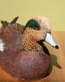
Wildfowl Carving Magazineby camelotnorthComment by HBunch: *Critique Club*
What stands out to me most is the shadow. I think it's a bit distracting. I think that with different lighting, not only would it help fix the shadow, but also help to bring out the colors a bit more in your image.
The horizontal line in your background isn't horizontal, which is also distracting.
I think I would have placed the subject on something other than a wooden table. Having it on wood, distracts from it being wood. Just too much wood to focus on just one of the wooden subjects. Table or Duck.
I also wonder how this would be as a close up. Maybe of just the head. I think it would show the detail a lot better and accentuate the fact that it's carved.
Your focus and clarity are good, but because of the lighting, we lose some of the detail on the top of his head.
Overall, the subject could definately be on the front cover, and with some minor adjustments, the photo as well.
~Heather~ |
 Photographer found comment helpful. Photographer found comment helpful. |
| 06/21/2003 02:31:06 AM |
|
| Photographer found comment helpful. |
| 06/20/2003 09:57:07 PM |
|
| Photographer found comment helpful. |
| 06/20/2003 09:18:33 PM |
|
| Photographer found comment helpful. |
| 06/20/2003 09:11:50 PM |
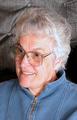
Yup...this is the real meby camelotnorthComment by carolee: I like the expression -- looks like you're in conversation with someone. It's a little snapshotty, the lighting and background look kind of unremarkable, but it's overall a clean shot. |
| Photographer found comment helpful. |
| 06/20/2003 01:18:20 PM |
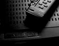
My entertainment centerby camelotnorthComment by eloise: Speaking only for my personal aesthetic preferences, the blotchy/gloppy over-modified 'focus' here is bizarre and very distracting. If it were focussed more mundanely, this could well have been a 9 for me. As it is, 5. |
| Photographer found comment helpful. |
| 06/20/2003 10:54:37 AM |
My entertainment centerby camelotnorthComment by mci: your digital effects are really detracting from this image. your choice of subjact matter was probably a little on the boring side and you felt the need to give more interest to the image, but it's not working. lighting seems okay, but i can't really tell much. it just doesn't have the feel of a "photograph". 3. |
| Photographer found comment helpful. |
| 06/20/2003 09:47:42 AM |
|
| Photographer found comment helpful. |
| 06/20/2003 03:03:22 AM |
My entertainment centerby camelotnorthComment by RiderGal: I know that this was an open editing challenge, but what you did to this photo makes it, in my mind, appear to be overprocessed, and look like a drawing/water color or something. I'm not sure I really care for what you did here. I think that emphasis on a photography website should still be put on the original picture more than the editing, even in an free for all editing challenge. Just my opinion though. |
| Photographer found comment helpful. |
| 06/20/2003 01:22:18 AM |
|
| Photographer found comment helpful. |
Home -
Challenges -
Community -
League -
Photos -
Cameras -
Lenses -
Learn -
Help -
Terms of Use -
Privacy -
Top ^
DPChallenge, and website content and design, Copyright © 2001-2026 Challenging Technologies, LLC.
All digital photo copyrights belong to the photographers and may not be used without permission.
Current Server Time: 07/24/2026 04:21:43 PM EDT.