Wildfowl Carving Magazineby
camelotnorthComment by HBunch: *Critique Club*
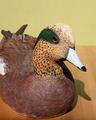
What stands out to me most is the shadow. I think it's a bit distracting. I think that with different lighting, not only would it help fix the shadow, but also help to bring out the colors a bit more in your image.
The horizontal line in your background isn't horizontal, which is also distracting.
I think I would have placed the subject on something other than a wooden table. Having it on wood, distracts from it being wood. Just too much wood to focus on just one of the wooden subjects. Table or Duck.
I also wonder how this would be as a close up. Maybe of just the head. I think it would show the detail a lot better and accentuate the fact that it's carved.
Your focus and clarity are good, but because of the lighting, we lose some of the detail on the top of his head.
Overall, the subject could definately be on the front cover, and with some minor adjustments, the photo as well.
~Heather~