| Image |
Comment |
| 08/18/2003 12:14:15 AM |
|
| 08/17/2003 01:18:35 PM |
|
 Photographer found comment helpful. Photographer found comment helpful. |
| 08/17/2003 08:40:48 AM |
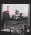
view from kitchen windowby camelotnorthComment by wewillexplore: Interesting use of desat, but I don't think it works here. There are too many artifacts of the desat along the wall and plant and sky - it looks like a hurried editing job instead of a smart color choice. This image has retained some of the overall redness, lessensing the effect of your edits. As far as the composition - it's very busy on the windowsill and the flowered thing and red birdfeeder(?) detract from the view...I'm not sure what I'm supposed to be admiring. |
| Photographer found comment helpful. |
| 08/16/2003 11:30:39 PM |
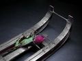
"Citizen Kane" (at movie's end)by camelotnorthComment by mcrochip: FIRST IMPRESSION: Very emotive shot - the rose really captures my eye, and makes me want to examine the rest of the photograph closer.
CHALLENGE: I'll have to take your word for it, as I've never seen Citizen Kane. However, given what you said the shot is mimicing, I'd say it's met.
COMPOSITION: If you hadn't mentioned the color adjustment, I don't know if I would have noticed - the color of the rose bears a striking contrast to the monochromatic colors of the remainder. Having read your comment, I see that is what you were going for. I like the framing as well.
TECHNICAL: The upper portion of the photograph is a hair darker than I'd like to see it. I like the black itself, but the portion of the hardware in the shot up in that area gets lost due to the very close color.
CONCLUSION: Meets the challenge well, and holds my interest as a viewer. The composition and technical aspects of this shot make it quite intriguing - if this movie were colorized, I wonder if they'd do the same thing with the color of the rose.
Thanks for sharing and good luck in future challenges! |
| 08/16/2003 07:57:05 PM |
|
| Photographer found comment helpful. |
| 08/16/2003 06:45:49 PM |
view from kitchen windowby camelotnorthComment by clues56: What a nce kitchen window to have! I think the picture would be improved if there were more even lighting. I am not much on flash, but I think a diffused flash would help you on this one. (Maybe move the things on the window sill, leaving the brushes and the red object.) |
| Photographer found comment helpful. |
| 08/16/2003 02:44:22 PM |
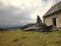
stormy desolationby camelotnorthComment by justesme: Firstly, I would have liked to see a straighter image. Secondly, more of the house in shambles! And maybe in black and white. I do not feel the backdrop of the sea and wonky horizon to be interesting enough [compared to house] to include in the image. Well done, Good try =) |
| Photographer found comment helpful. |
| 08/16/2003 02:34:23 PM |
|
| Photographer found comment helpful. |
| 08/15/2003 09:21:19 PM |
stormy desolationby camelotnorthComment by ursula: Very nice! One suggestion would be to straighten the horizon line, it might improve the picture some :) I love the textures/colours of the wood and the old house (barn?), and the clouds. ~8 |
| 08/15/2003 12:27:45 AM |
view from kitchen windowby camelotnorthComment by ChrisW123: Maybe a little less red saturation... that would have left less of the red "specks" on the window frame, etc., and still would have made the point. Really great shot I love it! 7. |
| Photographer found comment helpful. |
Home -
Challenges -
Community -
League -
Photos -
Cameras -
Lenses -
Learn -
Help -
Terms of Use -
Privacy -
Top ^
DPChallenge, and website content and design, Copyright © 2001-2026 Challenging Technologies, LLC.
All digital photo copyrights belong to the photographers and may not be used without permission.
Current Server Time: 07/22/2026 06:22:12 AM EDT.