| Image |
Comment |
| 08/15/2005 03:07:53 PM |
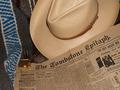
1881by HornOUBetComment by OdysseyF22: This might have looked good as a black-and-white, and a border would have improved it even more. But very cool idea, very much set in a specific time. |
 Photographer found comment helpful. Photographer found comment helpful. |
| 08/14/2005 10:33:27 PM |
1881by HornOUBetComment by Jutilda: Nice choice of objects - not overdone. I'd have used a sepia filter to age it even more. |
| Photographer found comment helpful. |
| 08/14/2005 06:53:59 PM |
1881by HornOUBetComment by Tammer: I think this would have worked better as a black & white photo. Also the change and...bullets (?) perhaps rearranged differently, but nice setup overall. |
| Photographer found comment helpful. |
| 08/13/2005 03:32:27 PM |
1881by HornOUBetComment by Balko: Thank you for meeting the challenge rules and a good photo to boot! 10 |
| Photographer found comment helpful. |
| 08/13/2005 01:32:39 PM |
1881by HornOUBetComment by chadb: Great shot, but the bullets and coins should have been placed elswhere so they stood out more. |
| Photographer found comment helpful. |
| 08/12/2005 04:14:24 PM |
|
| Photographer found comment helpful. |
| 08/12/2005 08:44:47 AM |
1881by HornOUBetComment by macrothing: 7 - Good effort to meet the Challenge. Criticism; I would like to see more detail (closer angle) on the smaller items, coins, bullets and watch. I also wonder if this photograph might have looked better in b/w, though I know those said smaller items would get 'lost' then, but if they were at the 'fore' perhaps that might have helped. Maybe just a different angle and placement of items (ie maybe the newspaper laying diagonally), would have made this a better photograph in my opinion. |
| Photographer found comment helpful. |
| 08/11/2005 12:31:08 PM |
|
| Photographer found comment helpful. |
| 08/10/2005 03:45:27 PM |
1881by HornOUBetComment by 1olddawg: The old newspaper looks great-unfortunately all the glare from the hat is ruining the old antique feel of the image. Not sure why the blue stripess are there(a bit distracting) |
| Photographer found comment helpful. |
| 08/10/2005 03:18:17 PM |
1881by HornOUBetComment by Xilebo: Wish you had put everything in the same tone, the only blue colored object is a bit in the way..nice composition though... |
| Photographer found comment helpful. |
Home -
Challenges -
Community -
League -
Photos -
Cameras -
Lenses -
Learn -
Help -
Terms of Use -
Privacy -
Top ^
DPChallenge, and website content and design, Copyright © 2001-2026 Challenging Technologies, LLC.
All digital photo copyrights belong to the photographers and may not be used without permission.
Current Server Time: 07/16/2026 09:52:36 PM EDT.