| Image |
Comment |
| 07/02/2003 01:18:04 AM |
|
| 06/01/2003 01:54:51 PM |
|
| 05/27/2003 07:56:37 PM |
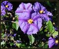
Deadly Nightshadeby IsaacComment by HBunch: *Critique Club*
The color is very nice, but I'm wondering if you could have gotten a different lighting and still gotten the good color.
The lighting, which I'm assuming is natural lighting is greating some harsh shadows in the background, and on the leaves.
The agle and framing/cropping are ok. I would mention though that maybe it's a little unballanced by the flowers being at the top, and one in the bottom right, but lots of blank in the bottom left.
I might have cropped this to just below the bigger main flower.
Focus and clarity are really pretty good. There is some blurr in the background to help the main subject stand out a bit better, and there is really good detail in the flowers themselves.
I'm not really sure if I like the orange in the border or not. it doesn't look really BAD, but not quite sure that it really does much to help either.
Keep clicking!
~Heather~ |
| 05/19/2003 02:42:28 PM |
|
| 05/18/2003 08:15:31 PM |
|
| 05/16/2003 02:35:10 PM |
|
| 05/15/2003 08:07:46 PM |
Deadly Nightshadeby IsaacComment by sherryk471: I like the color and it's very well balanced.Focus could have been alittle sharper but it's well within limits.=6 |
| 05/14/2003 12:42:24 PM |
|
| 05/10/2003 12:04:34 AM |
Cutlass In The Rainby IsaacComment by christo: What I like in this pic is the unusual crop. It is a strong statement you made here though. For me the interpretation is: "See how this guy is encaged in his car". This idea is strenghtened by the rain drops. If that's what you wanted to demonstrate, this is perfectly done.
But the drawback in my opinion is that the primary theme (transportation) is not obvious in this pic. Too much static. If you wanted to show a traffic jam to demonstrate the unefficiency of cars for transportation, a wider view would have been better in my opinion. This pic is more about loneliness.
Now maybe I totally misunderstood your pic, but in this case it would mean your picture is not obvious enough.
So, to summarize: a very original and interesting take on the subject, but that doesn't really well fits the theme in my opinion.
The Critique Club |
| 05/03/2003 03:17:45 PM |
|
Home -
Challenges -
Community -
League -
Photos -
Cameras -
Lenses -
Learn -
Help -
Terms of Use -
Privacy -
Top ^
DPChallenge, and website content and design, Copyright © 2001-2026 Challenging Technologies, LLC.
All digital photo copyrights belong to the photographers and may not be used without permission.
Current Server Time: 07/16/2026 11:21:09 PM EDT.