| Image |
Comment |
| 01/23/2005 07:36:37 PM |
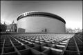
Van Gogh Museumby PanoComment by Imagineer: Great POV - intersting structure, with the people adding nice sense of scale (would have preferred them off-centre though). Good choice of centred comp to add strength. |
 Photographer found comment helpful. Photographer found comment helpful. |
| 01/23/2005 04:01:42 PM |
Van Gogh Museumby PanoComment by Keith Maniac: Great viewpoint. It's great that you got down low (?) to include all of that fabulous foreground. I think it would look better without the buildings in the far background, but there's nothing that you could have done about that! Good job. |
| Photographer found comment helpful. |
| 01/23/2005 09:24:34 AM |
|
| Photographer found comment helpful. |
| 01/20/2005 11:52:13 PM |
|
| Photographer found comment helpful. |
| 01/19/2005 08:57:11 PM |
Van Gogh Museumby PanoComment by ubique: Is it really? Vincent probably wouldn't have liked it much. Looks like a water reservoir, with a father watching his son trying to fill it up. Your point of view is nice, though, and at least gives this ghastly structure some visual interest. 5. |
| Photographer found comment helpful. |
| 01/19/2005 11:49:02 AM |
Sensitivaby PanoComment by tristalisk: Greetings from the Critique club!
Initial impact: woa thats ok of focus... ohh ok it's for the brokeh challenge.
Does it meet the challenge: IMO no. Brokeh is an out of focus background that enhances the image. I feel and you seem to feel the same way acording to your comments, that the image would look better if the heels were in focus. I also feel that for brokeh to work effectivly you should not be able to easily identify the background image.
Focus: Theres no need to rehash on the previous comment on brokeh.I read through the comments left to you from other voters and asij mention noise in the background. While I agree that neat image would work nicely on this, I dis agree that it is noise in the image. I think that what you are seeing is the panty hose. I have shot it several times and had similar results. I have discovered however that if you would like to keep the panty hose definable then a light coat of hairspray misted over them helps. Not 100% sure why but the lighting seems to like it better. However if you want a nice dark tan, neat image works very well.
Color: I like the colors fairly well. The rose is my only complaint in the catagory. I feel that a red rose would work better than the pink symbolicly than the pink. It repressents more of a lust in my mind wich work better with the heels in my opinion. The Rose also apears to be a little old, and is begining to wilt. If this was the idea perhaps a little older rose would have done better.
Over all: I think this is an absolutly great concept. I like the feeling and impact of the shot. But I feel that the rose and brokeh did not work well with the shot. On an off track did you try putting the heels in the foreground and the rose in the background? That might have worked.. well I hope my critique had at least somthing you found usefull in it for you. Best of luck in future challlenges!!
Tristalisk |
| Photographer found comment helpful. |
| 01/18/2005 12:51:04 PM |
|
| Photographer found comment helpful. |
| 01/17/2005 11:46:09 AM |
|
| Photographer found comment helpful. |
| 01/17/2005 06:04:27 AM |
Van Gogh Museumby PanoComment by Coreuk: Good picture, and it doesnt do it any harm being in black & white and the man with a kid.
|
| Photographer found comment helpful. |
| 01/16/2005 11:54:27 AM |
Sensitivaby PanoComment by ButterflySis: The idea is alright and the bokeh seems to be there but overall I don't care for this. It's very grainy and pixelated (could be from upload though), the pink rose clashes with the red shoes, and the rose seems to be...unhealthy; the leaves, especially, look diseased or something. |
| Photographer found comment helpful. |
Home -
Challenges -
Community -
League -
Photos -
Cameras -
Lenses -
Learn -
Help -
Terms of Use -
Privacy -
Top ^
DPChallenge, and website content and design, Copyright © 2001-2026 Challenging Technologies, LLC.
All digital photo copyrights belong to the photographers and may not be used without permission.
Current Server Time: 07/15/2026 04:14:18 PM EDT.