| Image |
Comment |
| 04/28/2006 01:20:37 PM |
|
 Photographer found comment helpful. Photographer found comment helpful. |
| 04/28/2006 05:06:52 AM |
|
| Photographer found comment helpful. |
| 04/28/2006 01:16:48 AM |
|
| Photographer found comment helpful. |
| 04/27/2006 10:40:43 PM |
|
| Photographer found comment helpful. |
| 04/27/2006 04:31:28 PM |
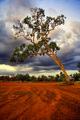
Colours Of Australiaby JudiComment by jrtodd: Stunning picture, it could be said there are some pictures that stuck to the theme more strict than this one, but what the hell this is good work and shows complementary colors. 10 |
| Photographer found comment helpful. |
| 04/27/2006 04:30:59 PM |
Enjoying the viewby JudiComment by e301: I like this; My own shot plays wth the idea of the two worlds of the refelected and the transmitted light, as does this. You've achieved more with the graphic relationship of that reflected world to the direct one though. One thing: I would wish for a more involved treatment of it. This comes across as very much a real world thing; perhaps taking this into the black and white world would emphasise those overlaid views a touch more - in effect, make the photograph be about those conjunctions, rather than the tendency of this to make it more of a portrait. I just neither likie nor understand the idea of the photographic portrait, you understand - it may be, to those who appreciate them, that this is a great one.
There's a temporariness about the bed here too - no valance, the shaping of the edge of that 'mattress' almost makes one think of a sofa-bed, or a guest room. I like that transience - and the complexity of those reflections just add to the absorption of the whole scene. Top work. |
| Photographer found comment helpful. |
| 04/27/2006 10:19:04 AM |
|
| Photographer found comment helpful. |
| 04/27/2006 05:21:32 AM |
|
| Photographer found comment helpful. |
| 04/27/2006 02:02:44 AM |
|
| Photographer found comment helpful. |
| 04/26/2006 11:25:34 PM |
|
| Photographer found comment helpful. |
Home -
Challenges -
Community -
League -
Photos -
Cameras -
Lenses -
Learn -
Help -
Terms of Use -
Privacy -
Top ^
DPChallenge, and website content and design, Copyright © 2001-2026 Challenging Technologies, LLC.
All digital photo copyrights belong to the photographers and may not be used without permission.
Current Server Time: 07/28/2026 07:40:38 AM EDT.