| Image |
Comment |
| 02/19/2007 06:57:17 AM |
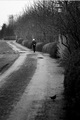
Path of lifeby BoltiComment by sabphoto: very very nice, when I saw the title I almost expected to see a cemetary down the path but glad I didn't. I like your depth of field and tones. great subject. |
 Photographer found comment helpful. Photographer found comment helpful. |
| 02/18/2007 04:27:58 PM |
|
| 02/15/2007 08:43:29 AM |
4 vs 1by BoltiComment by CNovack: Your lighting on the main elements is good as well as focus. The areas where the composition is weak is in visual interest and angle. With the exception of the reflections on the blue backdrop that are a distraction this is technically a good photo - in terms of focus is good and lighting is good. But an above average or exceptional photo needs to be more than technically good - the arrangement of compositional elements needs to be visually interesting to the viewer. First off the angle of the shot is stand-offish/distant/it does not draw us in. It is an overhead shot looking down - typically that angle is used to make your main subject small or give the impression of smallness (i.e. to convey the feelings of a person feeling very small a photographer will have there model put on a sad face and shot at an overhead angle looking down -typically that photo will have alot of negative space to add a feeling of emptiness to the mood of the person feeling small & insignificant.) There is no mood in this shot so that overhead angle does not help convey any additional information. A better angle would be to bring in the viewer by shooting at level with the fruit. That level brings us closer to your subjects - it can show us details in color tones and textures that we miss from a distant overhead shot. Bring us closer to the main subject. Show us more details in the textures and tonal colors of the fruit and/or veggies and that will draw in the viewer's eye. |
| Photographer found comment helpful. |
| 02/14/2007 10:36:59 AM |
4 vs 1by BoltiComment by neophyte: Great colors. The reflections are a bit distracting but overall nice and sharp.7 |
| Photographer found comment helpful. |
| 02/13/2007 08:55:12 PM |
|
| Photographer found comment helpful. |
| 02/12/2007 10:44:05 PM |
4 vs 1by BoltiComment by kelbelle: I have my money on Broc to win--the others come from trees but he IS a tree. Nice crisp colorful image. 8 |
| Photographer found comment helpful. |
| 02/12/2007 11:51:17 AM |
4 vs 1by BoltiComment by love: Very nice color and lighting.. don't care for the reflection though 7 |
| Photographer found comment helpful. |
| 02/12/2007 11:41:36 AM |
|
| Photographer found comment helpful. |
| 02/12/2007 04:32:14 AM |
|
| Photographer found comment helpful. |
| 02/10/2007 05:42:47 PM |
|
| Photographer found comment helpful. |
Home -
Challenges -
Community -
League -
Photos -
Cameras -
Lenses -
Learn -
Help -
Terms of Use -
Privacy -
Top ^
DPChallenge, and website content and design, Copyright © 2001-2026 Challenging Technologies, LLC.
All digital photo copyrights belong to the photographers and may not be used without permission.
Current Server Time: 06/23/2026 01:27:38 AM EDT.