|
|
Comments Received by npage
|
Showing 151 - 160 of ~220 |
| Image |
Comment |
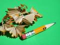
| 08/23/2002 10:33:00 PM | Stubbyby npageComment by RedRuthann: Very interesting (Running out of steam for commenting - so being brief) I like the green background - this is very bright. good work 8 Ruthann |
| 08/22/2002 04:58:00 PM | Stubbyby npageComment by MaYz: Nice lighting, Great focus and awesome color. The only thing I'm not too crazy about is the background. Yes, it does bring the pencil out more, but it seems a bit over powering. |
| 08/21/2002 10:25:00 PM | Stubbyby npageComment by jimmsp: Composition - very good Technical Aspects - very good Meets Challenge - yes Visual Impact / Originality – high Other suggestions – none Jim msp |
| 08/21/2002 08:49:00 PM | Stubbyby npageComment by Gene L.: Very good execution (could be a pun). The colors contrast nicely, the arrangement is simple yet effective, and the detail is excellent. |
| 08/21/2002 08:02:00 PM | Stubbyby npageComment by Gracious: From my perspective: Meets challenge:Yes Technical:fine Appeal/Artistic:good choice of bright background and the shapes of the shavings are nice Composition:fine Originality:fair Comments:Love your title...good description. Good luck in the challenge. |
| 08/21/2002 04:09:00 PM | |
| 08/21/2002 03:54:00 PM | Stubbyby npageComment by Willa: I think this is a well composed and interesting shot. I like that shadows from the pencil shavings, and the color of the background. Nice. |
| 08/21/2002 03:20:00 PM | Stubbyby npageComment by karmat: I really like the green background, and how it sets up the yellow pencil, or what's left of the pencil anyway. good job. karmat |
| 08/20/2002 07:23:00 PM | Stubbyby npageComment by autool: Composition: Subject Placement, Cropping, Background9, Technical: Focus, Exposure, Lighting, Processing9, Challenge: Does your entry meet it?10, Appeal: Is it Interesting, Motivating, Etc.? 8, Total Averaged Rating9. Autool |
| 08/20/2002 05:51:00 PM | Stubbyby npageComment by Kavey: Like colours, think background green really adds something. Feels unbalanced, too heavy to the left, perhaps because the pencil doesn't touch the edge of the frame but the shavings do. I like the way that only a tiny bit of the text remains on the pencil, just enough to give an abstract pattern, nothing more. 6, Kavey |
|
Showing 151 - 160 of ~220 |
Home -
Challenges -
Community -
League -
Photos -
Cameras -
Lenses -
Learn -
Help -
Terms of Use -
Privacy -
Top ^
DPChallenge, and website content and design, Copyright © 2001-2026 Challenging Technologies, LLC.
All digital photo copyrights belong to the photographers and may not be used without permission.
Current Server Time: 07/15/2026 07:04:31 PM EDT.
|