| Image |
Comment |
| 07/24/2005 12:17:17 PM |
|
 Photographer found comment helpful. Photographer found comment helpful. |
| 07/23/2005 06:30:21 PM |
|
| Photographer found comment helpful. |
| 07/22/2005 11:58:34 PM |
|
| Photographer found comment helpful. |
| 07/22/2005 04:07:30 PM |
|
| Photographer found comment helpful. |
| 07/22/2005 11:03:23 AM |
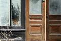
dare to knock?by saintaugustComment by cpanaioti: Composition: I like the idea and the two shapes, door area and window area, complement each other. However, the framing is too tight at the bottom and on the left. Also, the perspective is a little skewed probably due to the angle you chose to shoot at.
Exposure: Seems a little underexposed and the lighting is quite flat. Also, the colours seem a little drab. Maybe that's how they are but to get the image to pop I feel the yellow needs to be more saturated and there needs to be more contrast to bring out the texture of the stone.
Impact: A little due to the choice of subject however not enough to hold a viewer for more than a couple of seconds. |
| 07/22/2005 10:51:06 AM |
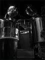
brew houseby saintaugustComment by saintaugust: Originally posted by cpanaioti:
Interesting shot. From the angle you've chosen it looks like to tin men looking down to see who's taking the picture.
The image may be slightly underexposed (though could just be this crappy monitor at work.) |
:-)
i did underexpose it for 2 reasons; 1 because at normal exposure it was too heavy of a shutter speed to deal with on my SD110 (especially after a couple of them guys in the foreground). second reason is that the highlights stood out much better that way.
thanks!
|
| 07/22/2005 10:44:20 AM |
brew houseby saintaugustComment by cpanaioti: Interesting shot. From the angle you've chosen it looks like to tin men looking down to see who's taking the picture.
The image may be slightly underexposed (though could just be this crappy monitor at work.) |
| Photographer found comment helpful. |
| 07/20/2005 03:36:21 PM |
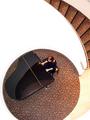
my 70's velour couch baby, YEAH!by saintaugustComment by sabphoto: Fits challenge=5
Color/lighting=0
DOF/focus=1
Wow factor/uniqueness=0
Attractiveness=0
I know from the subject that is does have nice texture but difficult to see it here. I wonder if a lower, right across the top of it, angle would work better. Good color.
Good luck |
| 07/20/2005 01:42:10 PM |
|
| Photographer found comment helpful. |
| 07/20/2005 01:26:32 PM |
|
| Photographer found comment helpful. |
Home -
Challenges -
Community -
League -
Photos -
Cameras -
Lenses -
Learn -
Help -
Terms of Use -
Privacy -
Top ^
DPChallenge, and website content and design, Copyright © 2001-2026 Challenging Technologies, LLC.
All digital photo copyrights belong to the photographers and may not be used without permission.
Current Server Time: 06/24/2026 01:40:54 AM EDT.