| Image |
Comment |
| 09/25/2005 06:35:31 PM |
Strengthby saintaugustComment by Tammer: When I draw the imaginery thirds grid on your photo, the intersecting points fall in kind of "flat" places for me - compared to other entries in the challenge. It's a nice architectural photo though, and I like the color treatment. |
 Photographer found comment helpful. Photographer found comment helpful. |
| 09/24/2005 10:52:33 AM |
|
| Photographer found comment helpful. |
| 09/23/2005 09:19:00 PM |
Strengthby saintaugustComment by cools98: Fit Challenge Criteria: 0/2
Contrast/Color: 2/2
Composition: 1/2
Photo Quality: 1/2
My Subjective Affinity: 1/2 |
| 09/23/2005 04:03:01 PM |
|
| Photographer found comment helpful. |
| 09/23/2005 04:29:30 AM |
|
| Photographer found comment helpful. |
| 09/22/2005 07:13:19 AM |
|
| Photographer found comment helpful. |
| 09/21/2005 11:15:26 AM |
Strengthby saintaugustComment by how03: Nice use of thirds in the highlight to shadow line. Shadow side has some very attractive detail. Would like to see subject at intersection of thirds for more visual impact. |
| Photographer found comment helpful. |
| 09/21/2005 08:31:34 AM |
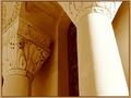
Final Messageby saintaugustComment by Tammer: I like how my eye can travel with the round lines of the photo - from the foreground up and to the windows. For me, I wish the colors were a bit more saturated as they look very rich. |
| Photographer found comment helpful. |
| 09/21/2005 08:17:36 AM |
Final Messageby saintaugustComment by JunieMoon: The photo is lit very nicely. Composition is wonderful, with all the curves. It does seem a little soft on the focus, though. Did you use a tripod? Also, when you compressed the image, it created a lot of artifacts (the many different colors which are very apparent on the upper wall) Here is what I read. To reduce artifacts, take the image in TIFF format, and as you adjust brightness and contrast, leave it in TIFF. Do not put in JPEG until you are absolutely sure it is edited as much as you want. Save only once, unless you need to adjust file to be smaller. Then submit. |
| Photographer found comment helpful. |
| 09/20/2005 07:27:52 PM |
|
| Photographer found comment helpful. |
Home -
Challenges -
Community -
League -
Photos -
Cameras -
Lenses -
Learn -
Help -
Terms of Use -
Privacy -
Top ^
DPChallenge, and website content and design, Copyright © 2001-2026 Challenging Technologies, LLC.
All digital photo copyrights belong to the photographers and may not be used without permission.
Current Server Time: 06/24/2026 08:09:48 PM EDT.