| Image |
Comment |
| 02/01/2005 02:08:56 PM |
|
| 02/01/2005 01:01:32 PM |
|
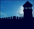
| 01/31/2005 07:57:59 PM |
light houseby gtp1164Comment by ButterflySis: I like the shapes and the color of the sky but I feel the silhouettes should be black rather than blue. I see a heavy blue cast on this. I would also like to see some detail in the fg. |
| 01/31/2005 07:13:26 PM |
|
| 01/31/2005 06:40:17 PM |
doing the hairby gtp1164Comment by Kylie: This is an awesome photo! Very lively, great contrast and colors, wonderful lighting and action. |
| 01/30/2005 11:49:44 PM |
nothing like old wine with a new roseby gtp1164Comment by Gatorguy: The old and new only comes through this image via the title, in my opinion. I think the photo, in and of itself, is pretty good - the neck of the bottle sort of disappears into the background though. |
| 01/30/2005 10:09:17 PM |
|
| 01/30/2005 09:07:20 PM |
a nice set of 3by gtp1164Comment by Catherine_B: While you met the criteria of the challenge, this subject is uninteresting and poorly executed. The framed art is too far apart and from the angle of the camera appears to be crooked. If you had taken these frames off of the wall and put them against a more interesting background close together, this image would have been better. |
| 01/30/2005 12:17:26 PM |
|
| 01/30/2005 12:13:41 PM |
|
Home -
Challenges -
Community -
League -
Photos -
Cameras -
Lenses -
Learn -
Help -
Terms of Use -
Privacy -
Top ^
DPChallenge, and website content and design, Copyright © 2001-2026 Challenging Technologies, LLC.
All digital photo copyrights belong to the photographers and may not be used without permission.
Current Server Time: 07/16/2026 12:27:54 AM EDT.