| Image |
Comment |
| 02/05/2005 06:54:18 PM |
|
| 02/05/2005 06:08:27 PM |
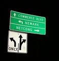
which way to go?by gtp1164Comment by Mr_Pants: Although the sign is bright against the dark background, it doesn't seem to 'pop' as it might. Maybe a little more sharpening? |
| 02/05/2005 04:22:32 PM |
|
| 02/05/2005 12:09:46 AM |
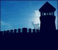
light houseby gtp1164Comment by rmtm333: Image has a dull overtone to it and seems a little out of focus. I like the silhoutte/backlighting but would have liked to seen it sharper. Good Luck. |
| 02/04/2005 05:56:10 PM |
|
| 02/04/2005 02:22:21 PM |
|
| 02/03/2005 08:06:31 PM |
|
| 02/03/2005 04:46:18 AM |
|
| 02/02/2005 11:14:54 AM |
which way to go?by gtp1164Comment by mcrochip: The solid black background works well in some photographs... but for me, this isn't one of them. To me, signs need to be in context, and with them floating in a NJ void it's just tough for me to reconcile. |
| 02/02/2005 05:22:27 AM |
light houseby gtp1164Comment by Hawkeye: Nice subject but personally I would have preferred to see the light coming from the lighthouse. |
Home -
Challenges -
Community -
League -
Photos -
Cameras -
Lenses -
Learn -
Help -
Terms of Use -
Privacy -
Top ^
DPChallenge, and website content and design, Copyright © 2001-2026 Challenging Technologies, LLC.
All digital photo copyrights belong to the photographers and may not be used without permission.
Current Server Time: 07/16/2026 08:05:50 AM EDT.