| Image |
Comment |
| 04/29/2005 07:33:44 AM |
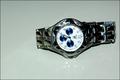
on sale 1,000by gtp1164Comment by SnapperL: position is not good. and the lighting could have been better. If you are getting to many glares from the ring then try a piece of paper to blanche the glare while still giving the good lighting. 5 |
| 04/28/2005 09:21:47 PM |
on sale 1,000by gtp1164Comment by MrsFuzzButt: Challenge: 6
Technical: 6
Interest: 5
Overall: 6
The lighting is a little much. The glare on the "background" surface is distracting as is the glare on the watch itself. The color of the background does nothing to enhance the watch... I think it actually makes it look more dull. Keep up the good work! |
| 04/28/2005 10:51:45 AM |
on sale 1,000by gtp1164Comment by fplouffe: Rotating the watch would have make the composition better. Seems that direct lighting was used which blow out detail on the dial and creates dark area like right side wrist band. |
| 04/28/2005 10:05:00 AM |
on sale 1,000by gtp1164Comment by glad2badad: The off-centering looks like an accident. Maybe if the spacing above and below were a little tighter. The lighting is a bit harsh...looks like a flash was used almost (I know it wasn't...). Nice watch. Good luck. |
| 04/28/2005 07:34:26 AM |
on sale 1,000by gtp1164Comment by suemack: Nice shot, focus is good but something about the lighting is not quite right.....bit flat I think. |
| 04/27/2005 09:23:01 PM |
|
| 04/27/2005 09:06:18 AM |
on sale 1,000by gtp1164Comment by srbrubaker: Pretty good choice of subject. The straight-on lighting casts harsh shadows. The composition is static, would have been better with left end cropped. Watch is just a little too far away and too unsharp. I want not only to be able to read the brand name, but the little lables in the blue dials. Not finding a compelling reason for the watch to be set on its side. If it is to be horizontal, it would seem a little neater if it were exactly horizontal. Hope some of these suggestions are helpful. |
| 04/26/2005 09:35:33 PM |
on sale 1,000by gtp1164Comment by bcoble: I believe the watch is on glass and the reflection is distracting. The watch is not displayed straight (not that this matters) . Not sure about the shadows on the right side (band). |
| 04/26/2005 05:13:54 PM |
on sale 1,000by gtp1164Comment by p3wiz: I would like this better if the watch was up and down, the cut off reflection of the watch also detracts. |
| 04/26/2005 02:46:07 PM |
on sale 1,000by gtp1164Comment by saiphfire: better if you'd edited out the reflection of the watch on the white surface... there's also a small hotspot on the face of the watch |
Home -
Challenges -
Community -
League -
Photos -
Cameras -
Lenses -
Learn -
Help -
Terms of Use -
Privacy -
Top ^
DPChallenge, and website content and design, Copyright © 2001-2026 Challenging Technologies, LLC.
All digital photo copyrights belong to the photographers and may not be used without permission.
Current Server Time: 07/17/2026 07:30:29 AM EDT.