on sale 1,000by
gtp1164Comment by HBunch: *Critique Club*
You got a lot of useful comments on this shot. Don't be afraid to check the 'useful' button to let the commenters know their time spent was appreciated.
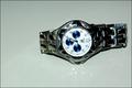
To be perfectly honest about this shot, it looks like you threw the watch on the table, took one shot, resized it and submitted. If you were the makers of this watch, would you buy this photo to advertise it?
The focus is soft, I cannot even read who makes the watch. The reflection might have been neat had it been a reflection of the entire watch, but it just looks like reflection from the light source.
Flash doesn't seem to me to be the best choice for lighting in an advertisment.
The background does not help to accentuate your subject either. There is a blue grey tint to it that takes away from the watch in my opinion.
The angle and framing also do not seem to increase interest in the watch. Maybe setting the watch upright so we could read the hands in normal position, or centering it a bit more, I think would add some visual appeal.
The one comment you received that I do not agree with in your case is the comment about setting the hands at 10 and 2. This only works if the watch manufacturer name is UNDER the center. If your watch were set at 10:10, the hands would be covering up the logo, and it would be pointless.
That being said, the other popular time for watches with the logo above the center (like yours) is 8:20. But again, I think that only works when the watch is upright.
~Heather~