| Image |
Comment |
| 06/02/2003 07:36:49 PM |
you QUACK me up!by TerryGeeComment by camelotnorth: very good job of creating a 3 dimensional duck..difficult with a black or white bird...the wll taken photo is well composed and stands out from the muted background.(10) |
| 06/02/2003 06:36:01 PM |
you QUACK me up!by TerryGeeComment by qachyk: Mmm, well... okay, I concede that to some this will evoke sound, even if that wasn't my first thought, so 'on topic' but only on second thought. Aside from that -- neat photo; I didn't know birds had tongues! You learn something new every day. |
| 06/02/2003 10:07:26 AM |
|
| 06/02/2003 09:49:08 AM |
you QUACK me up!by TerryGeeComment by eloise: 10 for concept, 8 for execution: 9 overall. :-> A little more drama in the pose/cropping/composition might well have pumped it a bit higher, but still, very good. I hear the photo (which is my major grading criteria for this contest), and it's an appealing image overall. Good focus, good light, good contrasts. |
| 06/02/2003 01:43:34 AM |
you QUACK me up!by TerryGeeComment by CLarson557: Very nice close-up!! Focus and DOF are nice. The duck really pops out. Great detail. He looks like he's warning you to get out of his space. Good job. 8 Good luck in the challenge. |
| 05/30/2003 10:08:28 PM |
Floating Flameby TerryGeeComment by inspzil: Greetings from the Critique Club
By Inspzil
Composition - This is a very nice photo. It is a worthy candidate for this challenge. I think the only thing I see right off the bat that I would change about it is that I wouldn't have cropped/taken the photo so tight to the flame. I'd have left a little more there. I think if you pulled back a little from the candle you'd have saturated the water just a little more naturally, without PS. I think the shadow in the water is really great. Nice work there.
Technical - A superior photo, no doubt. The colors are jumping out at we viewer types as they should be in this type of photo. The focus is just great too. A real clear well taken photo. If you did some PS to it, it doesn't show at all, which is a great sign. good work in portraying this shot this well.
Overall - Its a quality photograph all the way around. The only suggestion I can give is the one I gave earlier, to give the candle a little breathing room. Other than that, I couldn't have done it any better. Great work. - Inspzil |
| 05/29/2003 10:35:03 PM |
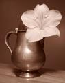
Age & Beautyby TerryGeeComment by DennisF: The tones in the container are very good. I think the container could have stood on its own. The composition including the flower seems too busy. |
| 05/26/2003 11:50:17 AM |
|
| 05/26/2003 09:11:21 AM |
Age & Beautyby TerryGeeComment by lizardbeth: The color tone is gorgeous. I wish you'd set the shot up on something other than that table though. I think the grain in the table is competing w/ the rest of the image. |
| 05/26/2003 01:53:20 AM |
Age & Beautyby TerryGeeComment by ChrisW123: Need more contrast. Darker shadow areas and whiter areas on the flower would be better. Plus there's too much tonal color for me. |
Home -
Challenges -
Community -
League -
Photos -
Cameras -
Lenses -
Learn -
Help -
Terms of Use -
Privacy -
Top ^
DPChallenge, and website content and design, Copyright © 2001-2026 Challenging Technologies, LLC.
All digital photo copyrights belong to the photographers and may not be used without permission.
Current Server Time: 07/19/2026 06:47:06 AM EDT.